
Data Security Glass Card
CodeFree
<!DOCTYPE html>
<html lang="en">
<head>
<meta charset="UTF-8">
<meta name="viewport" content="width=device-width, initial-scale=1">
<title>Instant enhancements</title>
<style>
:root{
  --bg:#F4F4F6; --ink:#1D1D1F; --mute:#86868B; --line:rgba(20,20,30,.08);
  --glass:rgba(255,255,255,.62); --green:#2DD55B;
  --lx:0; --ly:0;
}
*{box-sizing:border-box;margin:0}
html,body{height:100%}
body{
  background:var(--bg);color:var(--ink);
  font-family:Inter,system-ui,-apple-system,"Segoe UI",sans-serif;
  display:grid;place-items:center;overflow-x:hidden;
  -webkit-font-smoothing:antialiased;
}
.wrap{width:min(560px,60vw);padding:24px 0}
.stage{
  position:relative;width:100%;aspect-ratio:1/1;border-radius:28px;overflow:hidden;
  background:
    radial-gradient(60% 60% at 50% 46%,rgba(255,255,255,.95),rgba(255,255,255,0) 70%),
    linear-gradient(180deg,#F8F8FA,#EEEEF1);
  box-shadow:0 0 0 1px var(--line),0 30px 60px -30px rgba(30,30,50,.25);
  perspective:1000px;
}
.layer{position:absolute;inset:0;will-change:transform;transition:transform .25s cubic-bezier(.2,.7,.2,1)}
.w{
  position:absolute;border-radius:16px;
  background:linear-gradient(145deg,rgba(255,255,255,.85),rgba(255,255,255,.45));
  backdrop-filter:blur(14px);-webkit-backdrop-filter:blur(14px);
  border:1px solid rgba(255,255,255,.9);
  box-shadow:0 1px 0 #fff inset,0 0 0 1px var(--line),0 10px 24px -8px rgba(40,40,60,.18),0 2px 6px rgba(40,40,60,.06);
  color:var(--mute);font-size:12px;
}
/* Center icon */
.icon{
  position:absolute;left:50%;top:44%;width:36%;aspect-ratio:1;transform:translate(-50%,-50%);
  border-radius:30%;
  background:
    radial-gradient(120% 90% at 50% 0%,#fff 0%,rgba(255,255,255,0) 55%),
    linear-gradient(160deg,#F7F7F9 0%,#E3E3E8 55%,#D3D3DA 100%);
  box-shadow:
    0 1px 0 #fff inset,0 -2px 6px rgba(120,120,140,.25) inset,
    0 2px 4px rgba(40,40,60,.10),0 10px 20px rgba(40,40,60,.12),
    0 30px 50px -10px rgba(40,40,70,.25),0 60px 80px -30px rgba(40,40,70,.2);
  overflow:hidden;
}
.icon svg{position:absolute;inset:0;width:100%;height:100%}
.spec{
  position:absolute;width:70%;aspect-ratio:1;border-radius:50%;
  left:calc(68% + var(--lx)*18%);top:calc(78% + var(--ly)*18%);
  transform:translate(-50%,-50%);
  background:radial-gradient(circle,#fff 0%,rgba(255,255,255,.95) 14%,rgba(190,200,255,.45) 38%,rgba(255,255,255,0) 68%);
  mix-blend-mode:screen;opacity:calc(.75 + var(--i,0)*.25);pointer-events:none;
}
.halo{
  position:absolute;left:50%;top:44%;width:62%;aspect-ratio:1;border-radius:50%;
  transform:translate(calc(-50% + var(--lx)*20px),calc(-50% + var(--ly)*20px));
  background:radial-gradient(circle at 70% 78%,rgba(150,165,255,.35),rgba(255,255,255,0) 55%);
  filter:blur(18px);pointer-events:none;
}
/* Cursor */
.cursor{
  position:absolute;left:56%;top:50%;width:9%;opacity:0;
  transform:translate(60px,70px) scale(.9);
  animation:lock 1.1s .9s cubic-bezier(.2,.8,.2,1) forwards;
  filter:drop-shadow(0 6px 8px rgba(40,40,70,.3));
}
@keyframes lock{to{opacity:1;transform:translate(0,0) scale(1)}}
/* Widgets */
.progress{left:-4%;top:37%;width:34%;padding:10px 14px;transform:rotate(-6deg)}
.progress .row{display:flex;justify-content:space-between;align-items:baseline;font-size:12px}
.progress b{font-size:18px;font-weight:500;color:#55555B}
.track{height:5px;border-radius:5px;background:rgba(0,0,0,.08);margin-top:8px;overflow:hidden;box-shadow:0 1px 1px rgba(0,0,0,.08) inset}
.fill{height:100%;width:0;border-radius:5px;background:linear-gradient(90deg,#B6E04A,#6FCB3A);transition:width 2.2s .4s cubic-bezier(.22,1,.36,1)}
.sleep{left:3%;top:2%;width:38%;padding:12px 14px;transform:rotate(28deg);transform-origin:left top;left:6%;top:1%}
.sleep small{display:block;font-size:11px;letter-spacing:.01em}
.sleep strong{display:block;font-size:22px;font-weight:500;color:#3A3A40;margin-top:2px}
.bulb{position:absolute;right:14px;top:50%;width:10px;height:10px;border-radius:50%;background:var(--green);
  box-shadow:0 0 0 3px rgba(45,213,91,.18),0 0 14px 4px rgba(45,213,91,.55);animation:pulse 2.6s ease-in-out infinite}
@keyframes pulse{50%{box-shadow:0 0 0 5px rgba(45,213,91,.1),0 0 22px 7px rgba(45,213,91,.7)}}
.focus{left:-3%;top:66%;width:34%;padding:12px 14px;transform:rotate(-14deg);opacity:.8}
.focus strong{display:block;font-size:20px;font-weight:500;color:#9A9AA1;margin-top:2px}
.lines{left:42%;top:-2%;width:19%;height:28%;padding:12px 10px;display:flex;flex-direction:column;gap:6px}
.lines i{display:block;height:2px;border-radius:2px;background:#C3C3CA;margin:0 auto}
.gauge{left:66%;top:19%;width:13%;aspect-ratio:1;display:grid;place-items:center;transform:rotate(6deg)}
.gauge svg{position:absolute;inset:6%;width:88%;height:88%}
.gauge span{position:relative;top:22%;font-size:15px;font-weight:500;color:#55555B}
.meter{left:66%;top:34%;width:36%;height:14%;transform:rotate(-14deg);display:flex;align-items:center;gap:8px;padding:0 16px}
.meter i{display:block;width:3px;height:44%;border-radius:2px;background:#D5D5DB;transform:skewX(-14deg);transition:background .4s,box-shadow .4s}
.meter i.on{background:linear-gradient(#FF9F2E,#FF5A3C);box-shadow:0 0 8px rgba(255,120,60,.5)}
.avatar{left:76%;top:57%;width:17%;aspect-ratio:1;display:grid;place-items:center}
.avatar .pic{width:68%;aspect-ratio:1;border-radius:50%;background:radial-gradient(circle at 50% 35%,#F3D9C6 0 22%,transparent 23%),linear-gradient(#cfd0d6,#9a9ca6);box-shadow:0 0 0 3px #fff,0 4px 10px rgba(0,0,0,.2);position:relative;overflow:hidden}
.avatar .pic::after{content:"";position:absolute;left:18%;right:18%;bottom:-20%;height:45%;border-radius:50% 50% 0 0;background:#2A2A30}
.avatar .plus{position:absolute;right:6%;top:6%;width:22px;height:22px;border-radius:50%;background:#fff;color:#55555B;display:grid;place-items:center;font-size:15px;line-height:1;box-shadow:0 2px 6px rgba(0,0,0,.2)}
.curve{left:66%;top:75%;width:34%;height:20%;transform:rotate(14deg)}
.curve svg{position:absolute;inset:0;width:100%;height:100%}
.dial{left:25%;top:80%;width:11%;aspect-ratio:1;display:grid;place-items:center;font-size:15px;font-weight:500;color:#8A8A92;transform:rotate(-6deg)}
.wave{left:36%;top:78%;width:28%;height:16%;display:flex;align-items:flex-end;gap:5px;padding:12px 14px;background:linear-gradient(180deg,rgba(255,255,255,.5),rgba(255,255,255,.1));box-shadow:0 0 0 1px var(--line)}
.wave i{flex:1;border-radius:2px;background:linear-gradient(#C9C9D1,#E4E4E9);transform-origin:bottom;animation:bar 2.4s ease-in-out infinite}
@keyframes bar{50%{transform:scaleY(.45)}}
/* Copy */
.copy{margin-top:30px;padding:0 6px;max-width:460px}
.copy h1{font-size:28px;font-weight:600;letter-spacing:-.022em;line-height:1.15}
.copy p{margin-top:8px;font-size:17px;line-height:1.5;color:var(--mute)}
@media (prefers-reduced-motion:reduce){*{animation:none!important;transition:none!important}.cursor{opacity:1;transform:none}.fill{width:70%}}
</style>
</head>
<body>
<main class="wrap">
  <section class="stage" id="stage" aria-label="Interactive preview">
    <div class="halo"></div>

    <div class="layer" data-d="10">
      <div class="w sleep"><small>Sleep mode</small><strong>Active</strong><span class="bulb"></span></div>
      <div class="w focus"><small>Focus mode</small><strong>Disabled</strong></div>
    </div>

    <div class="layer" data-d="16">
      <div class="w lines" id="lines"></div>
      <div class="w progress"><div class="row"><span>Progress</span><b id="pct">0%</b></div><div class="track"><div class="fill" id="fill"></div></div></div>
      <div class="w dial">04</div>
    </div>

    <div class="layer" data-d="24">
      <div class="w gauge">
        <svg viewBox="0 0 100 100"><path d="M18 74A40 40 0 1 1 82 74" fill="none" stroke="#E2E2E8" stroke-width="7" stroke-linecap="round"/>
        <path d="M18 74A40 40 0 0 1 56 11" fill="none" stroke="#C9A96E" stroke-width="7" stroke-linecap="round"/>
        <line x1="52" y1="50" x2="56" y2="22" stroke="#1D1D1F" stroke-width="3" stroke-linecap="round"/></svg>
        <span>62</span>
      </div>
      <div class="w meter" id="meter"></div>
      <div class="w avatar"><div class="pic"></div><div class="plus">+</div></div>
      <div class="w curve"><svg viewBox="0 0 200 80" preserveAspectRatio="none"><path d="M10 30C60 5 90 20 120 45S170 62 185 56" fill="none" stroke="#9A9BC4" stroke-width="3" stroke-linecap="round"/><circle cx="188" cy="56" r="7" fill="#B8B8C0" stroke="#fff" stroke-width="2"/></svg></div>
      <div class="w wave" id="wave"></div>
    </div>

    <div class="layer" data-d="6">
      <div class="icon" id="icon">
        <svg viewBox="0 0 100 100">
          <defs>
            <linearGradient id="g" x1="0" y1="0" x2="1" y2="1"><stop offset="0" stop-color="#C4C4CC"/><stop offset="1" stop-color="#EDEDF1"/></linearGradient>
            <filter id="deb"><feDropShadow dx="0" dy="1.2" stdDeviation=".6" flood-color="#fff"/><feDropShadow dx="0" dy="-1" stdDeviation=".6" flood-color="#7A7A88" flood-opacity=".5"/></filter>
          </defs>
          <g filter="url(#deb)" transform="rotate(45 50 50)">
            <rect x="43" y="22" width="14" height="10" rx="3" fill="url(#g)"/>
            <path d="M43 36h14v34l-7 9-7-9z" fill="url(#g)"/>
          </g>
        </svg>
        <div class="spec"></div>
      </div>
      <svg class="cursor" viewBox="0 0 40 44"><path d="M4 3l32 17-14 4-5 16z" fill="#fff" stroke="#1D1D1F" stroke-width="2.5" stroke-linejoin="round"/></svg>
    </div>
  </section>

  <div class="copy">
    <h1>Instant enhancements.</h1>
    <p>Professional workflows automated instantly. Complexity turned into simplicity.</p>
  </div>
</main>

<script>
(function(){
  const $=id=>document.getElementById(id);
  const stage=$('stage'), root=document.documentElement;
  const layers=[...document.querySelectorAll('.layer')];

  // Build small graphics
  $('lines').innerHTML=Array.from({length:11},(_,i)=>`<i style="width:${55+((i*37)%40)}%"></i>`).join('');
  $('meter').innerHTML=Array.from({length:14},()=>'<i></i>').join('');
  $('wave').innerHTML=Array.from({length:14},(_,i)=>`<i style="height:${30+Math.abs(Math.sin(i*1.7))*65}%;animation-delay:${-i*.17}s"></i>`).join('');
  const bars=[...document.querySelectorAll('#meter i')];

  // Progress 0 -> 70
  requestAnimationFrame(()=>requestAnimationFrame(()=>{ $('fill').style.width='70%'; }));
  const t0=performance.now()+400, dur=2200;
  const ease=t=>1-Math.pow(1-t,4);
  (function tick(now){
    const p=Math.min(Math.max((now-t0)/dur,0),1);
    $('pct').textContent=Math.round(ease(p)*70)+'%';
    const on=Math.round(ease(p)*6);
    bars.forEach((b,i)=>b.classList.toggle('on',i<on));
    if(p<1) requestAnimationFrame(tick);
  })(performance.now());

  // Parallax + specular
  let tx=0,ty=0,cx=0,cy=0;
  function move(x,y){
    const r=stage.getBoundingClientRect();
    tx=Math.max(-1,Math.min(1,((x-r.left)/r.width-.5)*2));
    ty=Math.max(-1,Math.min(1,((y-r.top)/r.height-.5)*2));
  }
  addEventListener('pointermove',e=>move(e.clientX,e.clientY));
  addEventListener('pointerleave',()=>{tx=0;ty=0});
  const reduce=matchMedia('(prefers-reduced-motion:reduce)').matches;
  (function loop(){
    cx+=(tx-cx)*.08; cy+=(ty-cy)*.08;
    if(!reduce){
      layers.forEach(l=>{
        const d=+l.dataset.d;
        l.style.transform=`translate3d(${cx*-d}px,${cy*-d}px,0) rotateY(${cx*d*.12}deg) rotateX(${cy*-d*.12}deg)`;
      });
    }
    root.style.setProperty('--lx',(cx).toFixed(3));
    root.style.setProperty('--ly',(cy).toFixed(3));
    root.style.setProperty('--i',(Math.hypot(cx,cy)/1.41).toFixed(3));
    requestAnimationFrame(loop);
  })();
})();
</script>
</body>
</html>What’s inside
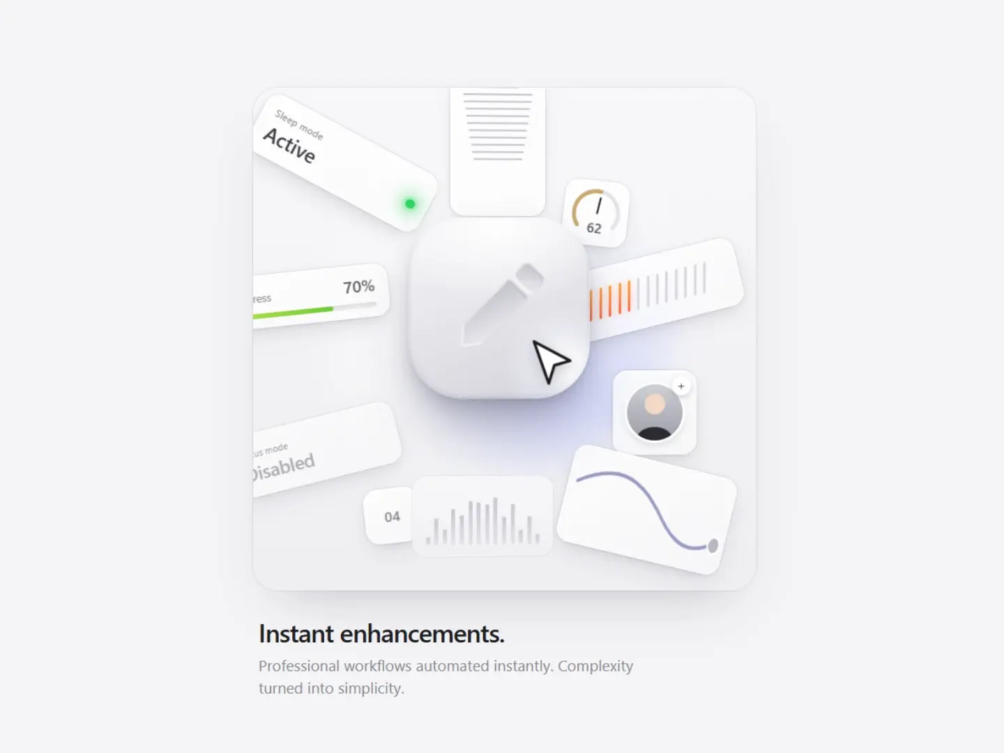
Tactile app icon with a debossed pen and brushed white finish Floating glass widgets: progress bar, status toggle, gauge, meter, and audio wave Mouse-based parallax, with each widget layer moving at its own depth Specular highlight that follows the cursor like real light Progress bar that eases from 0% to 70% on load Single HTML file, vanilla HTML, CSS, and JS only, no libraries