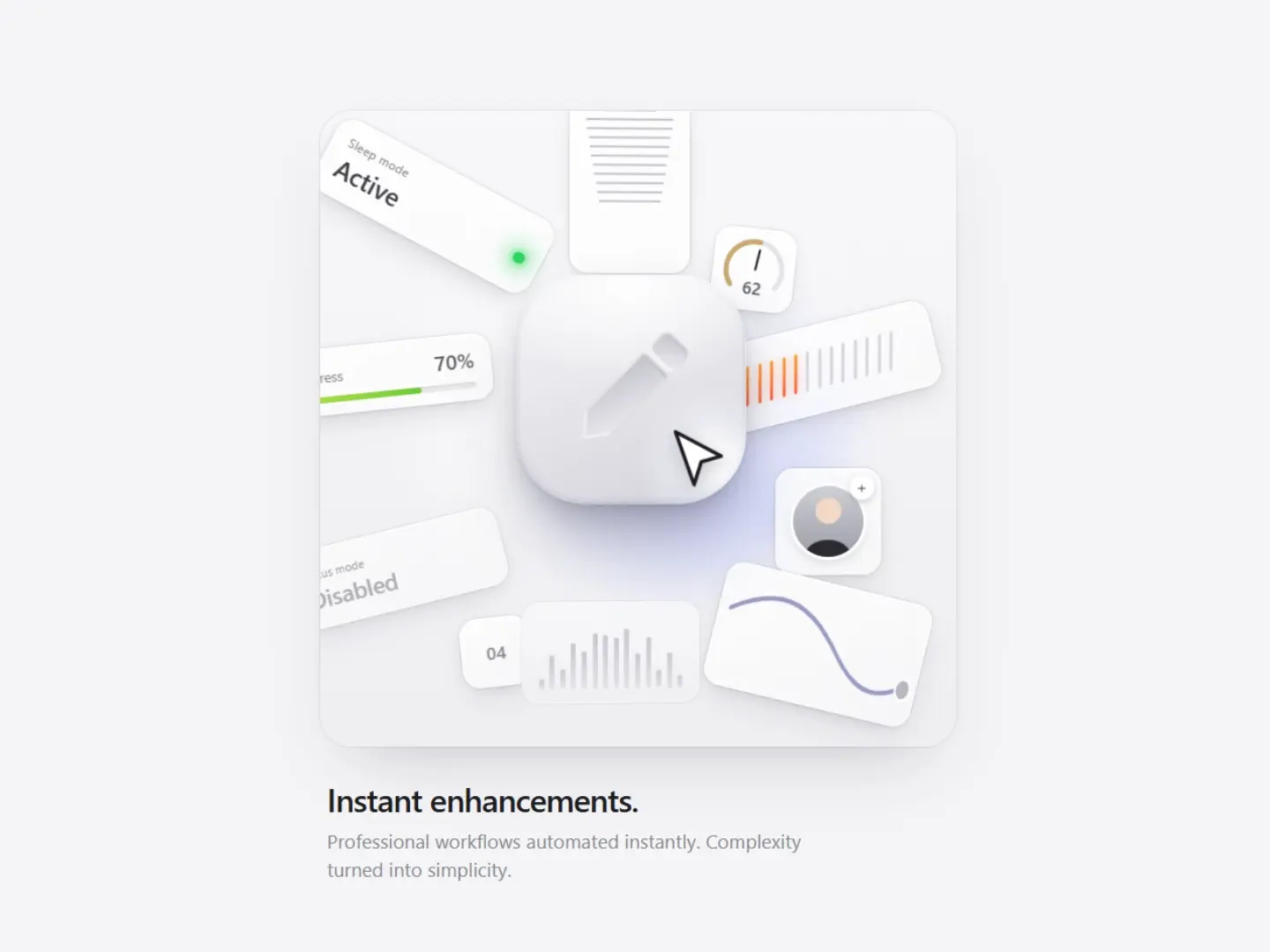
Instant Enhancements
CodeFree

<!DOCTYPE html>
<html lang="en">
<head>
  <meta charset="UTF-8" />
  <meta name="viewport" content="width=device-width, initial-scale=1.0" />
  <title>Data Security</title>
  <style>
    * {
      margin: 0;
      padding: 0;
      box-sizing: border-box;
    }

    body {
      min-height: 100vh;
      display: flex;
      align-items: center;
      justify-content: center;
      background: #050505;
      font-family: -apple-system, BlinkMacSystemFont, "Segoe UI", Roboto, Helvetica, Arial, sans-serif;
      overflow: hidden;
      position: relative;
    }

    /* Background ambient stars */
    .stars {
      position: absolute;
      inset: 0;
      pointer-events: none;
      z-index: 0;
    }

    .star {
      position: absolute;
      width: 2px;
      height: 2px;
      background: rgba(255, 255, 255, 0.7);
      border-radius: 50%;
      box-shadow: 0 0 4px rgba(255, 255, 255, 0.4);
      animation: twinkle var(--duration) ease-in-out infinite;
    }

    @keyframes twinkle {
      0%, 100% { opacity: 0.2; transform: scale(0.8); }
      50% { opacity: 1; transform: scale(1.2); }
    }

    /* Main card */
    .card {
      position: relative;
      width: 340px;
      padding: 36px 28px 32px;
      background: rgba(22, 22, 24, 0.65);
      backdrop-filter: blur(24px);
      -webkit-backdrop-filter: blur(24px);
      border-radius: 28px;
      border: 1px solid rgba(255, 255, 255, 0.08);
      box-shadow:
        0 0 0 1px rgba(255, 255, 255, 0.03),
        0 20px 50px rgba(0, 0, 0, 0.5),
        0 8px 20px rgba(0, 0, 0, 0.3),
        inset 0 1px 0 rgba(255, 255, 255, 0.06);
      overflow: hidden;
      z-index: 2;
    }

    /* Soft inner glow on card */
    .card::before {
      content: "";
      position: absolute;
      inset: 0;
      border-radius: 28px;
      background: radial-gradient(
        ellipse at 50% 20%,
        rgba(255, 255, 255, 0.04) 0%,
        transparent 60%
      );
      pointer-events: none;
    }

    /* Particles inside card */
    #particles {
      position: absolute;
      inset: 0;
      width: 100%;
      height: 100%;
      pointer-events: none;
      z-index: 1;
      border-radius: 28px;
    }

    /* Icon section */
    .icon-area {
      position: relative;
      height: 140px;
      display: flex;
      align-items: center;
      justify-content: center;
      margin-bottom: 28px;
      z-index: 2;
    }

    /* Soft connecting lines */
    .lines {
      position: absolute;
      width: 180px;
      height: 100px;
      top: 50%;
      left: 50%;
      transform: translate(-50%, -50%);
      pointer-events: none;
    }

    .line {
      position: absolute;
      background: linear-gradient(
        90deg,
        transparent 0%,
        rgba(255, 255, 255, 0.15) 20%,
        rgba(255, 255, 255, 0.25) 50%,
        rgba(255, 255, 255, 0.15) 80%,
        transparent 100%
      );
      height: 1.5px;
      border-radius: 2px;
      box-shadow: 0 0 6px rgba(255, 255, 255, 0.15);
      overflow: visible;
    }

    .line-h {
      width: 70px;
      top: 50%;
      transform: translateY(-50%);
    }

    .line-h.left { left: 0; }
    .line-h.right { right: 0; }

    .line-v {
      width: 1.5px;
      height: 36px;
      left: 50%;
      transform: translateX(-50%);
      background: linear-gradient(
        180deg,
        transparent 0%,
        rgba(255, 255, 255, 0.2) 40%,
        rgba(255, 255, 255, 0.25) 60%,
        transparent 100%
      );
    }

    .line-v.top { top: 8px; }
    .line-v.bottom { bottom: 8px; }

    /* Soft nodes / dots on lines */
    .node {
      position: absolute;
      width: 6px;
      height: 6px;
      background: rgba(255, 255, 255, 0.85);
      border-radius: 50%;
      box-shadow:
        0 0 8px rgba(255, 255, 255, 0.5),
        0 0 16px rgba(255, 255, 255, 0.2);
      animation: node-pulse 2.8s ease-in-out infinite;
      z-index: 2;
    }

    .node.left { left: 0; top: 50%; transform: translate(-50%, -50%); }
    .node.right { right: 0; top: 50%; transform: translate(50%, -50%); }
    .node.top { top: 0; left: 50%; transform: translate(-50%, -50%); }
    .node.bottom { bottom: 0; left: 50%; transform: translate(-50%, 50%); }

    /* Traveling particles on the lines */
    .travel {
      position: absolute;
      width: 5px;
      height: 5px;
      background: #ffffff;
      border-radius: 50%;
      box-shadow:
        0 0 6px rgba(255, 255, 255, 0.9),
        0 0 12px rgba(255, 255, 255, 0.5),
        0 0 18px rgba(255, 255, 255, 0.25);
      z-index: 3;
      pointer-events: none;
    }

    /* Horizontal left → right */
    .travel-h-left {
      top: 50%;
      left: 0;
      transform: translate(-50%, -50%);
      animation: travel-left 2.4s linear infinite;
    }

    /* Horizontal right → left */
    .travel-h-right {
      top: 50%;
      right: 0;
      transform: translate(50%, -50%);
      animation: travel-right 2.4s linear infinite;
      animation-delay: 1.2s;
    }

    /* Vertical top → bottom */
    .travel-v-top {
      left: 50%;
      top: 0;
      transform: translate(-50%, -50%);
      animation: travel-top 2s linear infinite;
      animation-delay: 0.4s;
    }

    /* Vertical bottom → top */
    .travel-v-bottom {
      left: 50%;
      bottom: 0;
      transform: translate(-50%, 50%);
      animation: travel-bottom 2s linear infinite;
      animation-delay: 1.4s;
    }

    @keyframes travel-left {
      0%   { left: 0;   opacity: 0; }
      10%  { opacity: 1; }
      90%  { opacity: 1; }
      100% { left: 100%; opacity: 0; }
    }

    @keyframes travel-right {
      0%   { right: 0;   opacity: 0; }
      10%  { opacity: 1; }
      90%  { opacity: 1; }
      100% { right: 100%; opacity: 0; }
    }

    @keyframes travel-top {
      0%   { top: 0;   opacity: 0; }
      10%  { opacity: 1; }
      90%  { opacity: 1; }
      100% { top: 100%; opacity: 0; }
    }

    @keyframes travel-bottom {
      0%   { bottom: 0;   opacity: 0; }
      10%  { opacity: 1; }
      90%  { opacity: 1; }
      100% { bottom: 100%; opacity: 0; }
    }

    /* Soft lock icon container */
    .lock-wrap {
      width: 72px;
      height: 72px;
      border-radius: 20px;
      background: linear-gradient(
        145deg,
        rgba(40, 40, 45, 0.9) 0%,
        rgba(28, 28, 32, 0.95) 100%
      );
      border: 1px solid rgba(255, 255, 255, 0.1);
      display: flex;
      align-items: center;
      justify-content: center;
      box-shadow:
        0 8px 24px rgba(0, 0, 0, 0.4),
        0 2px 6px rgba(0, 0, 0, 0.3),
        inset 0 1px 0 rgba(255, 255, 255, 0.08),
        inset 0 -1px 0 rgba(0, 0, 0, 0.2);
      position: relative;
      z-index: 3;
      animation: soft-float 5s ease-in-out infinite;
    }

    .lock-wrap::before {
      content: "";
      position: absolute;
      inset: -1px;
      border-radius: 21px;
      background: linear-gradient(
        135deg,
        rgba(255, 255, 255, 0.12) 0%,
        transparent 40%,
        transparent 60%,
        rgba(255, 255, 255, 0.05) 100%
      );
      pointer-events: none;
      z-index: -1;
    }

    .lock-icon {
      width: 28px;
      height: 28px;
      fill: none;
      stroke: #ffffff;
      stroke-width: 1.8;
      stroke-linecap: round;
      stroke-linejoin: round;
      filter: drop-shadow(0 0 6px rgba(255, 255, 255, 0.3));
    }

    /* Soft tag */
    .tag {
      display: inline-flex;
      align-items: center;
      padding: 7px 16px;
      background: rgba(255, 255, 255, 0.07);
      border: 1px solid rgba(255, 255, 255, 0.1);
      border-radius: 999px;
      color: #ffffff;
      font-size: 13.5px;
      font-weight: 600;
      letter-spacing: 0.2px;
      margin-bottom: 16px;
      box-shadow:
        0 2px 8px rgba(0, 0, 0, 0.25),
        inset 0 1px 0 rgba(255, 255, 255, 0.06);
      position: relative;
      z-index: 2;
      transition: background 0.25s ease, border-color 0.25s ease;
    }

    .tag:hover {
      background: rgba(255, 255, 255, 0.1);
      border-color: rgba(255, 255, 255, 0.16);
    }

    /* Description */
    .desc {
      font-size: 13.5px;
      line-height: 1.55;
      color: rgba(255, 255, 255, 0.55);
      margin-bottom: 22px;
      max-width: 260px;
      position: relative;
      z-index: 2;
    }

    /* Learn more */
    .learn {
      display: inline-flex;
      align-items: center;
      gap: 6px;
      color: rgba(255, 255, 255, 0.75);
      font-size: 13.5px;
      font-weight: 500;
      text-decoration: none;
      position: relative;
      z-index: 2;
      transition: color 0.2s ease;
    }

    .learn:hover {
      color: #ffffff;
    }

    .learn svg {
      width: 14px;
      height: 14px;
      stroke: currentColor;
      stroke-width: 2;
      fill: none;
      transition: transform 0.2s ease;
    }

    .learn:hover svg {
      transform: translate(2px, -2px);
    }

    /* Animations */
    @keyframes soft-float {
      0%, 100% { transform: translateY(0); }
      50% { transform: translateY(-5px); }
    }

    @keyframes node-pulse {
      0%, 100% {
        opacity: 0.7;
        box-shadow:
          0 0 6px rgba(255, 255, 255, 0.4),
          0 0 12px rgba(255, 255, 255, 0.15);
      }
      50% {
        opacity: 1;
        box-shadow:
          0 0 10px rgba(255, 255, 255, 0.7),
          0 0 20px rgba(255, 255, 255, 0.3);
      }
    }
  </style>
</head>
<body>
  <!-- Ambient background stars -->
  <div class="stars" id="stars"></div>

  <div class="card">
    <canvas id="particles"></canvas>

    <div class="icon-area">
      <div class="lines">
        <div class="line line-h left">
          <div class="travel travel-h-left"></div>
        </div>
        <div class="line line-h right">
          <div class="travel travel-h-right"></div>
        </div>
        <div class="line line-v top">
          <div class="travel travel-v-top"></div>
        </div>
        <div class="line line-v bottom">
          <div class="travel travel-v-bottom"></div>
        </div>

        <div class="node left"></div>
        <div class="node right"></div>
        <div class="node top"></div>
        <div class="node bottom"></div>
      </div>

      <div class="lock-wrap">
        <svg class="lock-icon" viewBox="0 0 24 24">
          <rect x="5" y="11" width="14" height="10" rx="2" />
          <path d="M8 11V7a4 4 0 0 1 8 0v4" />
        </svg>
      </div>
    </div>

    <div class="tag">Data Security</div>

    <p class="desc">
      Protecting your payroll data with advanced encryption and realtime monitoring to prevent unauthorized access and breaches
    </p>

    <a href="#" class="learn">
      Learn more
      <svg viewBox="0 0 24 24">
        <path d="M7 17L17 7M17 7H9M17 7v8" />
      </svg>
    </a>
  </div>

  <script>
    // Background stars
    const starsContainer = document.getElementById("stars");
    for (let i = 0; i < 40; i++) {
      const star = document.createElement("div");
      star.className = "star";
      star.style.left = Math.random() * 100 + "%";
      star.style.top = Math.random() * 100 + "%";
      star.style.setProperty("--duration", (2 + Math.random() * 4) + "s");
      star.style.animationDelay = Math.random() * 3 + "s";
      starsContainer.appendChild(star);
    }

    // Particles inside the card
    const canvas = document.getElementById("particles");
    const ctx = canvas.getContext("2d");

    function resize() {
      const rect = canvas.parentElement.getBoundingClientRect();
      canvas.width = rect.width;
      canvas.height = rect.height;
    }
    resize();
    window.addEventListener("resize", resize);

    const particles = [];
    const count = 22;

    for (let i = 0; i < count; i++) {
      particles.push({
        x: Math.random() * canvas.width,
        y: Math.random() * canvas.height,
        size: Math.random() * 1.6 + 0.4,
        speedX: (Math.random() - 0.5) * 0.25,
        speedY: (Math.random() - 0.5) * 0.25,
        opacity: Math.random() * 0.3 + 0.08
      });
    }

    function animate() {
      ctx.clearRect(0, 0, canvas.width, canvas.height);

      particles.forEach(p => {
        p.x += p.speedX;
        p.y += p.speedY;

        if (p.x < 0 || p.x > canvas.width) p.speedX *= -1;
        if (p.y < 0 || p.y > canvas.height) p.speedY *= -1;

        p.opacity += (Math.random() - 0.5) * 0.008;
        p.opacity = Math.max(0.05, Math.min(0.35, p.opacity));

        // soft particle
        ctx.beginPath();
        ctx.arc(p.x, p.y, p.size, 0, Math.PI * 2);
        ctx.fillStyle = `rgba(255, 255, 255, ${p.opacity})`;
        ctx.fill();

        // soft glow
        ctx.beginPath();
        ctx.arc(p.x, p.y, p.size * 3, 0, Math.PI * 2);
        ctx.fillStyle = `rgba(255, 255, 255, ${p.opacity * 0.15})`;
        ctx.fill();
      });

      requestAnimationFrame(animate);
    }

    animate();
  </script>
</body>
</html>Soft glassmorphism card with subtle glow Lock icon with soft floating animation Glowing particles that travel along the connecting lines Ambient particles floating inside the card Soft frosted “Data Security” tag Clean “Learn more” link with hover effect