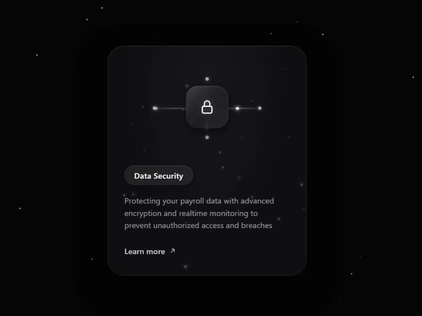
Data Security Glass Card
CodeFree
<!DOCTYPE html>
<html lang="en">
<head>
  <meta charset="UTF-8" />
  <meta name="viewport" content="width=device-width, initial-scale=1.0" />
  <title>Export and Share – Step 3</title>
  <style>
    * {
      margin: 0;
      padding: 0;
      box-sizing: border-box;
    }

    body {
      min-height: 100vh;
      display: flex;
      align-items: center;
      justify-content: center;
      background: #f0f0f2;
      font-family: -apple-system, BlinkMacSystemFont, "sans-serif", Roboto, Helvetica, Arial, sans-serif;
      overflow: hidden;
    }

    /* Outer card */
    .card {
      position: relative;
      width: 380px;
      background: #ffffff;
      border-radius: 28px;
      box-shadow:
        0 4px 6px rgba(0, 0, 0, 0.02),
        0 12px 24px rgba(0, 0, 0, 0.04),
        0 24px 48px rgba(0, 0, 0, 0.03);
      overflow: hidden;
      border: 1px solid rgba(255, 255, 255, 0.8);
    }

    /* Top illustration area */
    .illustration {
      position: relative;
      height: 280px;
      background: linear-gradient(180deg, #f7f7f9 0%, #f2f2f5 100%);
      display: flex;
      align-items: center;
      justify-content: center;
      overflow: hidden;
    }

    /* Soft inner glow / vignette */
    .illustration::before {
      content: "";
      position: absolute;
      inset: 0;
      background: radial-gradient(
        ellipse at 50% 40%,
        rgba(255, 255, 255, 0.7) 0%,
        transparent 70%
      );
      pointer-events: none;
    }

    /* Particles canvas */
    #particles {
      position: absolute;
      inset: 0;
      width: 100%;
      height: 100%;
      pointer-events: none;
      z-index: 1;
    }

    /* Main icon group */
    .icon-group {
      position: relative;
      z-index: 2;
      display: flex;
      flex-direction: column;
      align-items: center;
    }

    /* Soft folder / tray */
    .tray {
      width: 120px;
      height: 52px;
      background: linear-gradient(180deg, #ffffff 0%, #f4f4f6 100%);
      border-radius: 12px 12px 18px 18px;
      box-shadow:
        0 8px 20px rgba(0, 0, 0, 0.06),
        0 2px 4px rgba(0, 0, 0, 0.03),
        inset 0 1px 0 rgba(255, 255, 255, 0.9),
        inset 0 -2px 4px rgba(0, 0, 0, 0.02);
      position: relative;
      display: flex;
      align-items: flex-start;
      justify-content: center;
      padding-top: 6px;
    }

    /* Soft PPT document */
    .ppt {
      width: 72px;
      height: 86px;
      background: linear-gradient(145deg, #7b8cff 0%, #5b6ef5 45%, #4a5de0 100%);
      border-radius: 10px 14px 10px 10px;
      position: relative;
      top: -38px;
      box-shadow:
        0 10px 25px rgba(91, 110, 245, 0.35),
        0 4px 10px rgba(91, 110, 245, 0.2),
        inset 0 1px 0 rgba(255, 255, 255, 0.35),
        inset 0 -2px 6px rgba(0, 0, 0, 0.1);
      display: flex;
      flex-direction: column;
      align-items: center;
      justify-content: center;
      animation: float 4s ease-in-out infinite;
    }

    /* Soft folded corner */
    .ppt::before {
      content: "";
      position: absolute;
      top: 0;
      right: 0;
      width: 18px;
      height: 18px;
      background: linear-gradient(135deg, #a8b4ff 0%, #8a9af8 100%);
      border-radius: 0 14px 0 0;
      box-shadow: -1px 1px 2px rgba(0, 0, 0, 0.08);
    }

    .ppt::after {
      content: "";
      position: absolute;
      top: 0;
      right: 0;
      width: 0;
      height: 0;
      border-style: solid;
      border-width: 0 18px 18px 0;
      border-color: transparent #e8eafc transparent transparent;
      border-radius: 0 14px 0 0;
    }

    .ppt-label {
      color: white;
      font-weight: 700;
      font-size: 15px;
      letter-spacing: 0.5px;
      text-shadow: 0 1px 2px rgba(0, 0, 0, 0.15);
      margin-bottom: 10px;
    }

    .ppt-line {
      width: 28px;
      height: 3px;
      background: rgba(255, 255, 255, 0.55);
      border-radius: 2px;
      box-shadow: 0 1px 1px rgba(0, 0, 0, 0.1);
    }

    /* Soft download button */
    .download-btn {
      width: 52px;
      height: 52px;
      border-radius: 50%;
      background: linear-gradient(145deg, #6d7ff7 0%, #5b6ef5 50%, #4a5ce8 100%);
      display: flex;
      align-items: center;
      justify-content: center;
      margin-top: -22px;
      position: relative;
      z-index: 3;
      box-shadow:
        0 8px 24px rgba(91, 110, 245, 0.45),
        0 3px 8px rgba(91, 110, 245, 0.3),
        inset 0 1px 0 rgba(255, 255, 255, 0.4),
        inset 0 -2px 4px rgba(0, 0, 0, 0.12);
      animation: pulse-glow 3s ease-in-out infinite;
      cursor: pointer;
      transition: transform 0.25s ease, box-shadow 0.25s ease;
    }

    .download-btn:hover {
      transform: scale(1.08);
      box-shadow:
        0 12px 32px rgba(91, 110, 245, 0.55),
        0 4px 12px rgba(91, 110, 245, 0.35),
        inset 0 1px 0 rgba(255, 255, 255, 0.45);
    }

    .download-btn svg {
      width: 22px;
      height: 22px;
      fill: none;
      stroke: white;
      stroke-width: 2.4;
      stroke-linecap: round;
      stroke-linejoin: round;
      filter: drop-shadow(0 1px 1px rgba(0, 0, 0, 0.15));
    }

    /* Soft glow ring under the button */
    .glow-ring {
      position: absolute;
      width: 70px;
      height: 70px;
      border-radius: 50%;
      background: radial-gradient(
        circle,
        rgba(91, 110, 245, 0.35) 0%,
        rgba(91, 110, 245, 0.12) 40%,
        transparent 70%
      );
      top: 50%;
      left: 50%;
      transform: translate(-50%, -50%);
      z-index: 1;
      pointer-events: none;
      animation: ring-pulse 3s ease-in-out infinite;
    }

    /* Content area */
    .content {
      padding: 28px 32px 36px;
      text-align: center;
      background: #ffffff;
    }

    .step {
      font-size: 12px;
      font-weight: 500;
      letter-spacing: 1.5px;
      color: #a0a0a8;
      margin-bottom: 10px;
      text-transform: uppercase;
    }

    .title {
      font-size: 24px;
      font-weight: 500;
      color: #1a1a1f;
      margin-bottom: 12px;
      letter-spacing: -0.3px;
    }

    .description {
      font-size: 15px;
      line-height: 1.55;
      color: #6b6b75;
      max-width: 300px;
      margin: 0 auto;
    }

    /* Animations */
    @keyframes float {
      0%, 100% {
        transform: translateY(0);
      }
      50% {
        transform: translateY(-6px);
      }
    }

    @keyframes pulse-glow {
      0%, 100% {
        box-shadow:
          0 8px 24px rgba(91, 110, 245, 0.45),
          0 3px 8px rgba(91, 110, 245, 0.3),
          inset 0 1px 0 rgba(255, 255, 255, 0.4),
          inset 0 -2px 4px rgba(0, 0, 0, 0.12);
      }
      50% {
        box-shadow:
          0 10px 30px rgba(91, 110, 245, 0.55),
          0 4px 12px rgba(91, 110, 245, 0.4),
          inset 0 1px 0 rgba(255, 255, 255, 0.45),
          inset 0 -2px 4px rgba(0, 0, 0, 0.12);
      }
    }

    @keyframes ring-pulse {
      0%, 100% {
        opacity: 0.7;
        transform: translate(-50%, -50%) scale(1);
      }
      50% {
        opacity: 1;
        transform: translate(-50%, -50%) scale(1.15);
      }
    }
  </style>
</head>
<body>
  <div class="card">
    <div class="illustration">
      <canvas id="particles"></canvas>

      <div class="icon-group">
        <div class="tray">
          <div class="ppt">
            <div class="ppt-label">PPT</div>
            <div class="ppt-line"></div>
          </div>
        </div>

        <div style="position: relative;">
          <div class="glow-ring"></div>
          <div class="download-btn">
            <svg viewBox="0 0 24 24">
              <path d="M12 5v12M7 12l5 5 5-5" />
            </svg>
          </div>
        </div>
      </div>
    </div>

    <div class="content">
      <h2 class="title">Export and Share</h2>
      <p class="description">
        Export your video in the best quality and<br />
        share it on your social media or website.
      </p>
    </div>
  </div>

  <script>
    // Soft floating particles
    const canvas = document.getElementById("particles");
    const ctx = canvas.getContext("2d");

    function resize() {
      const rect = canvas.parentElement.getBoundingClientRect();
      canvas.width = rect.width;
      canvas.height = rect.height;
    }
    resize();
    window.addEventListener("resize", resize);

    const particles = [];
    const count = 28;

    for (let i = 0; i < count; i++) {
      particles.push({
        x: Math.random() * canvas.width,
        y: Math.random() * canvas.height,
        size: Math.random() * 2.2 + 0.6,
        speedX: (Math.random() - 0.5) * 0.35,
        speedY: (Math.random() - 0.5) * 0.35,
        opacity: Math.random() * 0.35 + 0.1,
        hue: 220 + Math.random() * 40 // soft blue-purple range
      });
    }

    function animate() {
      ctx.clearRect(0, 0, canvas.width, canvas.height);

      particles.forEach(p => {
        p.x += p.speedX;
        p.y += p.speedY;

        // soft bounce
        if (p.x < 0 || p.x > canvas.width) p.speedX *= -1;
        if (p.y < 0 || p.y > canvas.height) p.speedY *= -1;

        // gentle opacity pulse
        p.opacity += (Math.random() - 0.5) * 0.01;
        p.opacity = Math.max(0.08, Math.min(0.45, p.opacity));

        ctx.beginPath();
        ctx.arc(p.x, p.y, p.size, 0, Math.PI * 2);
        ctx.fillStyle = `hsla(${p.hue}, 70%, 65%, ${p.opacity})`;
        ctx.fill();

        // soft glow
        ctx.beginPath();
        ctx.arc(p.x, p.y, p.size * 2.5, 0, Math.PI * 2);
        ctx.fillStyle = `hsla(${p.hue}, 70%, 70%, ${p.opacity * 0.25})`;
        ctx.fill();
      });

      requestAnimationFrame(animate);
    }

    animate();
  </script>
</body>
</html>Soft Export & Share Card
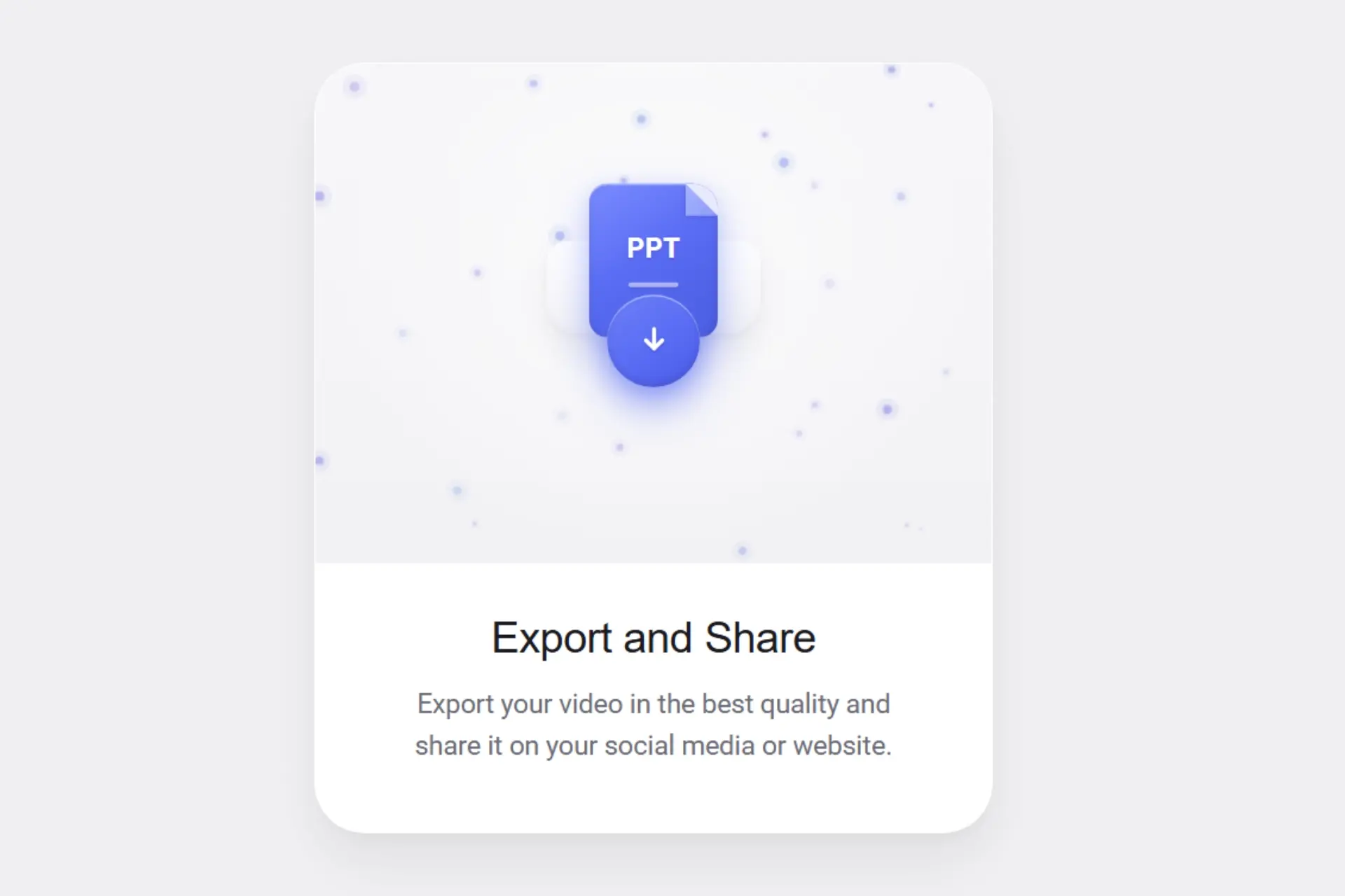
Soft neumorphic PPT document icon with gentle float Ambient particles floating inside the card Soft glowing download button with a pulse effect Clean Export and Share layout Light, modern, and premium feel