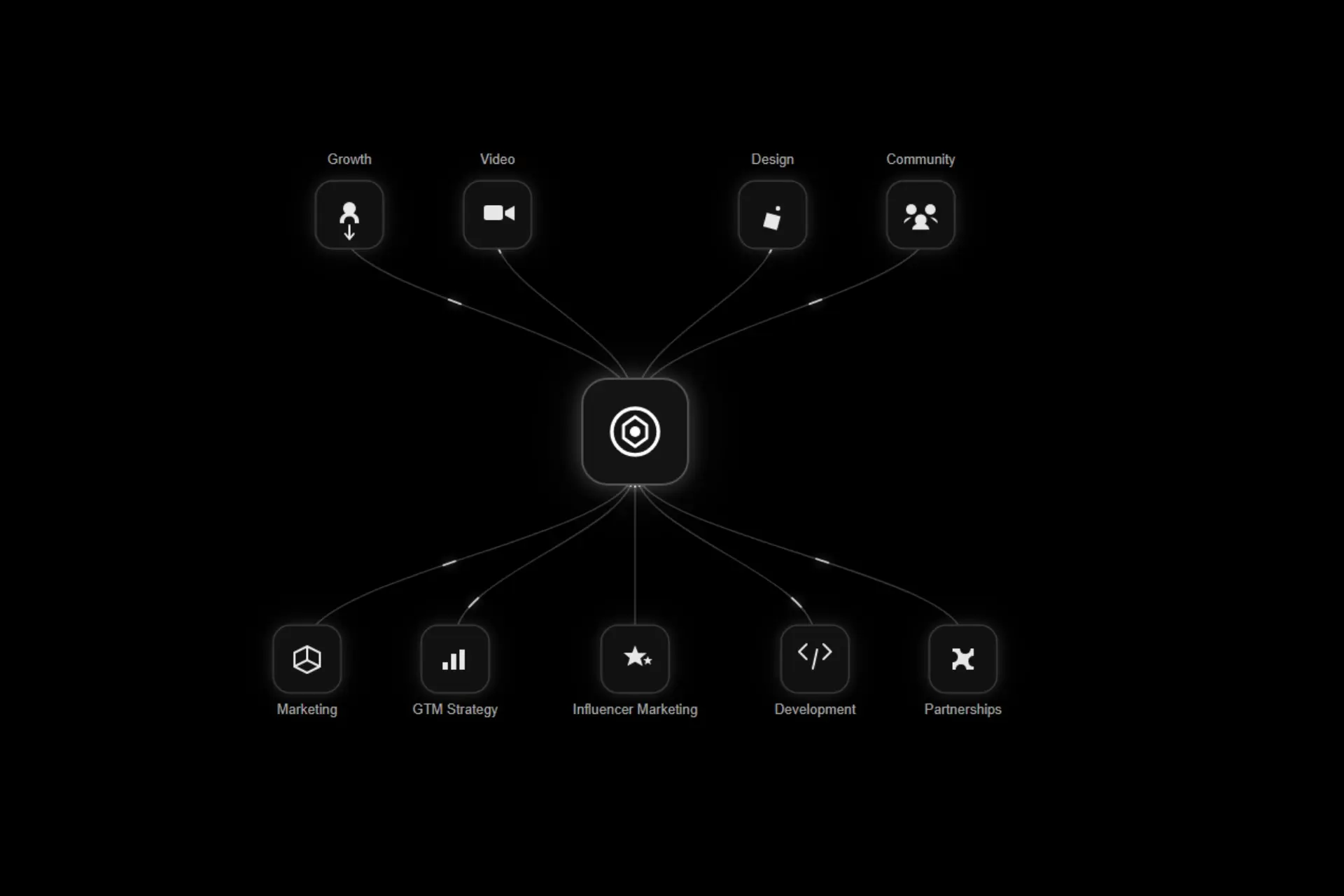
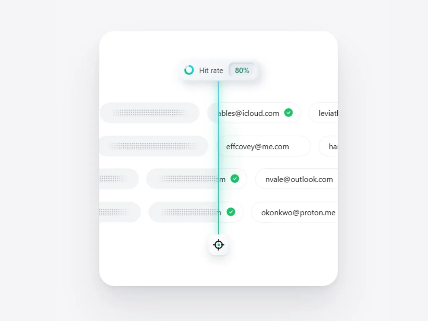
Hit Rate Scan Card
CodePremium
<!DOCTYPE html>
<html lang="en">
<head>
<meta charset="UTF-8">
<meta name="viewport" content="width=device-width, initial-scale=1">
<title>Advanced analytics</title>
<style>
  :root {
    --bg: #f1f3f1;
    --card: #ffffff;
    --ink: #111312;
    --muted: #9a9e9b;
    --green: #4fae1f;
    --green-hi: #b6e03a;
    --green-lo: #0f8a43;
    --bar: #dbe8dc;
    --ease: cubic-bezier(0.22, 1, 0.36, 1);
  }
  * { box-sizing: border-box; margin: 0; padding: 0; }
  html, body { height: 100%; }
  body {
    min-height: 100vh;
    display: grid;
    place-items: center;
    padding: 24px;
    font-family: "Inter", system-ui, -apple-system, "Segoe UI", Roboto, sans-serif;
    color: var(--ink);
    background:
      radial-gradient(1200px 900px at 50% 100%, #e6f4e6 0%, rgba(230,244,230,0) 70%),
      radial-gradient(900px 700px at 50% 0%, #f7f8f7 0%, rgba(247,248,247,0) 70%),
      var(--bg);
    -webkit-font-smoothing: antialiased;
  }

  .card {
    width: min(412px, 80%);
    background: var(--card);
    border-radius: 28px;
    padding: 8px 8px 34px;
    box-shadow:
      0 1px 2px rgba(20, 40, 25, 0.04),
      0 8px 16px rgba(20, 40, 25, 0.04),
      0 24px 48px rgba(20, 40, 25, 0.06),
      0 48px 80px rgba(20, 60, 30, 0.07);
    opacity: 0;
    transform: translateY(16px) scale(0.96);
    animation: cardIn 0.9s var(--ease) 0.05s forwards;
  }
  @keyframes cardIn { to { opacity: 1; transform: none; } }

  /* ---------- Visual panel ---------- */
  .panel {
    position: relative;
    height: 342px;
    border-radius: 22px;
    overflow: hidden;
    background: linear-gradient(180deg, #f4f6f4 0%, #f2f7f2 45%, #e7f6e5 100%);
  }

  .pills {
    position: absolute;
    top: 25px; left: 0; right: 0;
    display: flex;
    flex-wrap: wrap;
    justify-content: center;
    gap: 10px 8px;
    padding: 0 26px;
    z-index: 3;
  }
  .pill {
    display: inline-flex;
    align-items: center;
    gap: 12px;
    padding: 8px 16px;
    border-radius: 999px;
    background: rgba(255, 255, 255, 0.88);
    box-shadow: 0 1px 2px rgba(20,40,25,0.05), 0 4px 10px rgba(20,40,25,0.03);
    font-size: 14px;
    letter-spacing: -0.005em;
    cursor: default;
    opacity: 0;
    transform: translateY(-8px);
    animation: pillIn 0.7s var(--ease) forwards;
    transition: transform 0.35s var(--ease), box-shadow 0.35s ease, background 0.35s ease;
  }
  .pill:nth-child(1) { animation-delay: 0.45s; }
  .pill:nth-child(2) { animation-delay: 0.55s; }
  .pill:nth-child(3) { animation-delay: 0.65s; }
  .pill:nth-child(4) { animation-delay: 0.75s; }
  @keyframes pillIn { to { opacity: 1; transform: none; } }
  .pill .sep { width: 1px; height: 12px; background: #d4d8d5; }
  .pill .val { color: var(--green); font-weight: 500; transition: color .3s ease; }
  .pill.lifted, .pill:hover {
    transform: translateY(-3px);
    background: #fff;
    box-shadow:
      0 2px 4px rgba(20,40,25,0.05),
      0 10px 22px rgba(60,160,40,0.16),
      0 0 0 1px rgba(120,200,70,0.18);
  }
  .pill:hover .val { color: #3d9a12; }

  /* ---------- Chart ---------- */
  .chart {
    position: absolute;
    left: 24px; right: 24px;
    bottom: 0;
    height: 205px;
    display: flex;
    align-items: flex-end;
    justify-content: space-between;
  }
  .bar-slot {
    position: relative;
    width: 34px;
    height: 100%;
    display: flex;
    align-items: flex-end;
    cursor: pointer;
  }
  .bar {
    position: relative;
    width: 100%;
    height: 0;
    border-radius: 3px 3px 0 0;
    background: linear-gradient(180deg, rgba(205,225,207,0.9) 0%, rgba(215,232,217,0.85) 100%);
    transform-origin: bottom center;
    transition:
      height 1.3s var(--ease),
      transform 0.45s var(--ease),
      opacity 0.45s ease,
      filter 0.45s ease,
      background 0.45s ease,
      box-shadow 0.45s ease;
  }
  /* fade-out edges like the reference */
  .bar-slot:first-child .bar { background: linear-gradient(90deg, rgba(215,232,217,0) 0%, rgba(215,232,217,0.9) 100%); }
  .bar-slot:last-child  .bar { background: linear-gradient(90deg, rgba(215,232,217,0.9) 0%, rgba(215,232,217,0) 100%); }

  .bar.featured {
    background: linear-gradient(180deg, var(--green-hi) 0%, #7ccb2a 35%, #2fa43b 70%, var(--green-lo) 100%);
    border-radius: 5px 5px 0 0;
    box-shadow:
      0 0 0 3px rgba(255,255,255,0.75),
      0 0 26px 4px rgba(120, 205, 60, 0.45),
      inset 0 1px 1px rgba(255,255,255,0.7);
    animation: breathe 4.2s ease-in-out 2.2s infinite;
  }
  .bar.featured::after { /* tiny sparkle texture */
    content: "";
    position: absolute; inset: 0;
    border-radius: inherit;
    background:
      radial-gradient(circle at 70% 14%, rgba(255,255,255,.9) 0 1px, transparent 1.5px),
      radial-gradient(circle at 28% 28%, rgba(255,255,255,.7) 0 1px, transparent 1.5px),
      radial-gradient(circle at 60% 40%, rgba(255,255,255,.6) 0 1px, transparent 1.5px),
      radial-gradient(circle at 40% 8%,  rgba(255,255,255,.8) 0 1px, transparent 1.5px);
    pointer-events: none;
  }
  @keyframes breathe {
    0%, 100% { box-shadow: 0 0 0 3px rgba(255,255,255,0.75), 0 0 20px 2px rgba(120,205,60,0.32), inset 0 1px 1px rgba(255,255,255,0.7); filter: saturate(1); }
    50%      { box-shadow: 0 0 0 3px rgba(255,255,255,0.85), 0 0 36px 8px rgba(120,205,60,0.55), inset 0 1px 1px rgba(255,255,255,0.8); filter: saturate(1.12); }
  }

  /* hover: dim siblings, lift hovered bar */
  .chart.hovering .bar-slot:not(.active) .bar { opacity: 0.35; filter: saturate(0.6); }
  .chart.hovering .bar-slot.active .bar { transform: scaleX(1.12) scaleY(1.025); }
  .chart.hovering .bar-slot.active .bar:not(.featured) {
    background: linear-gradient(180deg, #b9dfb4 0%, #cfe8cb 100%);
    box-shadow: 0 0 22px 2px rgba(120, 205, 60, 0.28);
  }
  .chart.hovering .bar-slot.active .bar.featured { animation-play-state: paused; }

  /* tooltip value */
  .tip {
    position: absolute;
    left: 50%; bottom: calc(100% + 8px);
    transform: translate(-50%, 6px);
    padding: 4px 8px;
    border-radius: 8px;
    background: #fff;
    color: var(--ink);
    font-size: 11px; font-weight: 500;
    box-shadow: 0 2px 8px rgba(20,40,25,0.12);
    white-space: nowrap;
    opacity: 0;
    pointer-events: none;
    transition: opacity .3s ease, transform .4s var(--ease);
    z-index: 4;
  }
  .bar-slot.active .bar .tip { opacity: 1; transform: translate(-50%, 0); }

  /* ---------- Average line ---------- */
  .avg {
    position: absolute;
    left: 24px; right: 24px;
    z-index: 2;
    pointer-events: none;
  }
  .avg .line {
    position: absolute; left: 0; right: 0; top: 0;
    height: 1px;
    background-image: repeating-linear-gradient(90deg, #1f7a3a 0 6px, transparent 6px 11px);
    -webkit-mask-image: linear-gradient(90deg, transparent 0, #000 12%, #000 88%, transparent 100%);
            mask-image: linear-gradient(90deg, transparent 0, #000 12%, #000 88%, transparent 100%);
    clip-path: inset(0 100% 0 0);
    animation: draw 1.4s var(--ease) 1.0s forwards;
  }
  @keyframes draw { to { clip-path: inset(0 0 0 0); } }
  .avg .label {
    position: absolute;
    left: 28px; top: -16px;
    font-size: 10.5px;
    color: #4a8a5a;
    letter-spacing: 0.01em;
    opacity: 0;
    animation: fade 0.8s ease 1.6s forwards;
  }
  .avg .label b { font-weight: 500; color: #1f7a3a; }
  @keyframes fade { to { opacity: 1; } }

  .node {
    position: absolute;
    top: 0;
    width: 17px; height: 17px;
    margin: -8px 0 0 -8.5px;
    border-radius: 50%;
    background: #fff;
    box-shadow:
      0 0 0 3px rgba(255,255,255,0.55),
      0 0 14px 4px rgba(255,255,255,0.95),
      0 1px 4px rgba(20,80,30,0.35);
    transform: scale(0);
    opacity: 0;
    animation: nodeIn 0.7s var(--ease) 1.9s forwards, nodePulse 4.2s ease-in-out 2.6s infinite;
  }
  .node::after {
    content: ""; position: absolute; inset: 4px;
    border-radius: 50%;
    background: radial-gradient(circle, #fff 0%, #dff0d6 100%);
  }
  @keyframes nodeIn { to { transform: scale(1); opacity: 1; } }
  @keyframes nodePulse {
    0%, 100% { box-shadow: 0 0 0 3px rgba(255,255,255,0.55), 0 0 12px 3px rgba(255,255,255,0.85), 0 1px 4px rgba(20,80,30,0.35); }
    50%      { box-shadow: 0 0 0 6px rgba(255,255,255,0.35), 0 0 22px 8px rgba(255,255,255,1),    0 1px 4px rgba(20,80,30,0.35); }
  }

  /* ---------- Text ---------- */
  .copy { padding: 26px 26px 0; }
  .copy h2 {
    font-size: 25px;
    font-weight: 600;
    letter-spacing: -0.025em;
    line-height: 1.15;
    color: var(--ink);
  }
  .copy p {
    margin-top: 8px;
    font-size: 20px;
    line-height: 1.22;
    letter-spacing: -0.02em;
    color: var(--muted);
    max-width: 22em;
  }
  .copy h2, .copy p { opacity: 0; transform: translateY(8px); animation: pillIn 0.8s var(--ease) forwards; }
  .copy h2 { animation-delay: 0.9s; }
  .copy p  { animation-delay: 1.05s; }

  @media (max-width: 420px) {
    .panel { height: 320px; }
    .bar-slot { width: 28px; }
    .copy h2 { font-size: 22px; }
    .copy p { font-size: 17px; }
  }
  @media (prefers-reduced-motion: reduce) {
    *, *::before, *::after { animation-duration: 0.01ms !important; animation-delay: 0s !important; animation-iteration-count: 1 !important; transition-duration: 0.01ms !important; }
  }
</style>
</head>
<body>

<main class="card" id="card">
  <section class="panel" id="panel">
    <div class="pills" id="pills">
      <div class="pill"><span>Engagement</span><i class="sep"></i><span class="val">+18%</span></div>
      <div class="pill"><span>Followers</span><i class="sep"></i><span class="val">+26%</span></div>
      <div class="pill"><span>Reach</span><i class="sep"></i><span class="val">+65%</span></div>
      <div class="pill"><span>Activity</span><i class="sep"></i><span class="val">+34%</span></div>
    </div>

    <div class="chart" id="chart" role="img" aria-label="Weekly performance bar chart with the peak day highlighted"></div>

    <div class="avg" id="avg" aria-hidden="true">
      <div class="line"></div>
      <div class="label">1 Week <b>Avg.</b></div>
      <div class="node" id="node"></div>
    </div>
  </section>

  <section class="copy">
    <h2>Advanced analytics</h2>
    <p>Deep, actionable insights into performance and audience trends.</p>
  </section>
</main>

<script>
(function () {
  // Bar heights as a fraction of the chart area; index 3 is the featured peak.
  const data = [
    { h: 0.48, label: "Mon" },
    { h: 0.72, label: "Tue" },
    { h: 0.60, label: "Wed" },
    { h: 1.00, label: "Thu", featured: true },
    { h: 0.48, label: "Fri" },
    { h: 0.83, label: "Sat" },
    { h: 0.92, label: "Sun" }
  ];
  const AVG = 0.72;           // average line position (fraction of chart height)
  const CHART_H = 205;        // keep in sync with .chart height
  const PEAK_PX = 205;        // tallest bar height in px

  const chart = document.getElementById('chart');
  const avg   = document.getElementById('avg');
  const node  = document.getElementById('node');
  const panel = document.getElementById('panel');
  const pills = document.querySelectorAll('.pill');
  const bars  = [];

  data.forEach((d, i) => {
    const slot = document.createElement('div');
    slot.className = 'bar-slot';
    const bar = document.createElement('div');
    bar.className = 'bar' + (d.featured ? ' featured' : '');
    bar.dataset.target = d.h;
    const tip = document.createElement('span');
    tip.className = 'tip';
    tip.textContent = d.label + ' · ' + Math.round(d.h * 100);
    bar.appendChild(tip);
    slot.appendChild(bar);
    chart.appendChild(slot);
    bars.push({ slot, bar, d, i });

    slot.addEventListener('mouseenter', () => setActive(slot));
    slot.addEventListener('mouseleave', clearActive);
    slot.addEventListener('focus', () => setActive(slot));
    slot.addEventListener('blur', clearActive);
    slot.tabIndex = 0;
  });

  function setActive(slot) {
    chart.classList.add('hovering');
    bars.forEach(b => b.slot.classList.toggle('active', b.slot === slot));
  }
  function clearActive() {
    chart.classList.remove('hovering');
    bars.forEach(b => b.slot.classList.remove('active'));
  }

  // Position the average line + node relative to the panel
  function layout() {
    const panelRect = panel.getBoundingClientRect();
    const chartRect = chart.getBoundingClientRect();
    const baseY = chartRect.bottom - panelRect.top;
    const y = baseY - chartRect.height * (AVG * (PEAK_PX / CHART_H));
    avg.style.top = y + 'px';
    const featured = bars.find(b => b.d.featured);
    const fr = featured.slot.getBoundingClientRect();
    node.style.left = (fr.left + fr.width / 2 - panelRect.left - parseFloat(getComputedStyle(avg).left)) + 'px';
  }

  // Intro: grow bars from 0 with a stagger
  function grow() {
    bars.forEach(({ bar, d, i }) => {
      bar.style.transitionDelay = (0.35 + i * 0.09) + 's, 0s, 0s, 0s, 0s, 0s';
      requestAnimationFrame(() => requestAnimationFrame(() => {
        bar.style.height = (d.h * PEAK_PX) + 'px';
      }));
      // clear delay after intro so hover feels instant
      setTimeout(() => { bar.style.transitionDelay = '0s'; }, 2200);
    });
  }

  // Pills: gentle light shift that follows the cursor
  pills.forEach(p => {
    p.addEventListener('mousemove', e => {
      const r = p.getBoundingClientRect();
      const x = ((e.clientX - r.left) / r.width) * 100;
      p.style.background =
        'radial-gradient(120px circle at ' + x + '% 50%, #f1fbe8 0%, #ffffff 70%)';
    });
    p.addEventListener('mouseleave', () => { p.style.background = ''; });
  });

  layout();
  window.addEventListener('resize', layout);
  window.addEventListener('load', layout);
  grow();
})();
</script>
</body>
</html>What’s inside
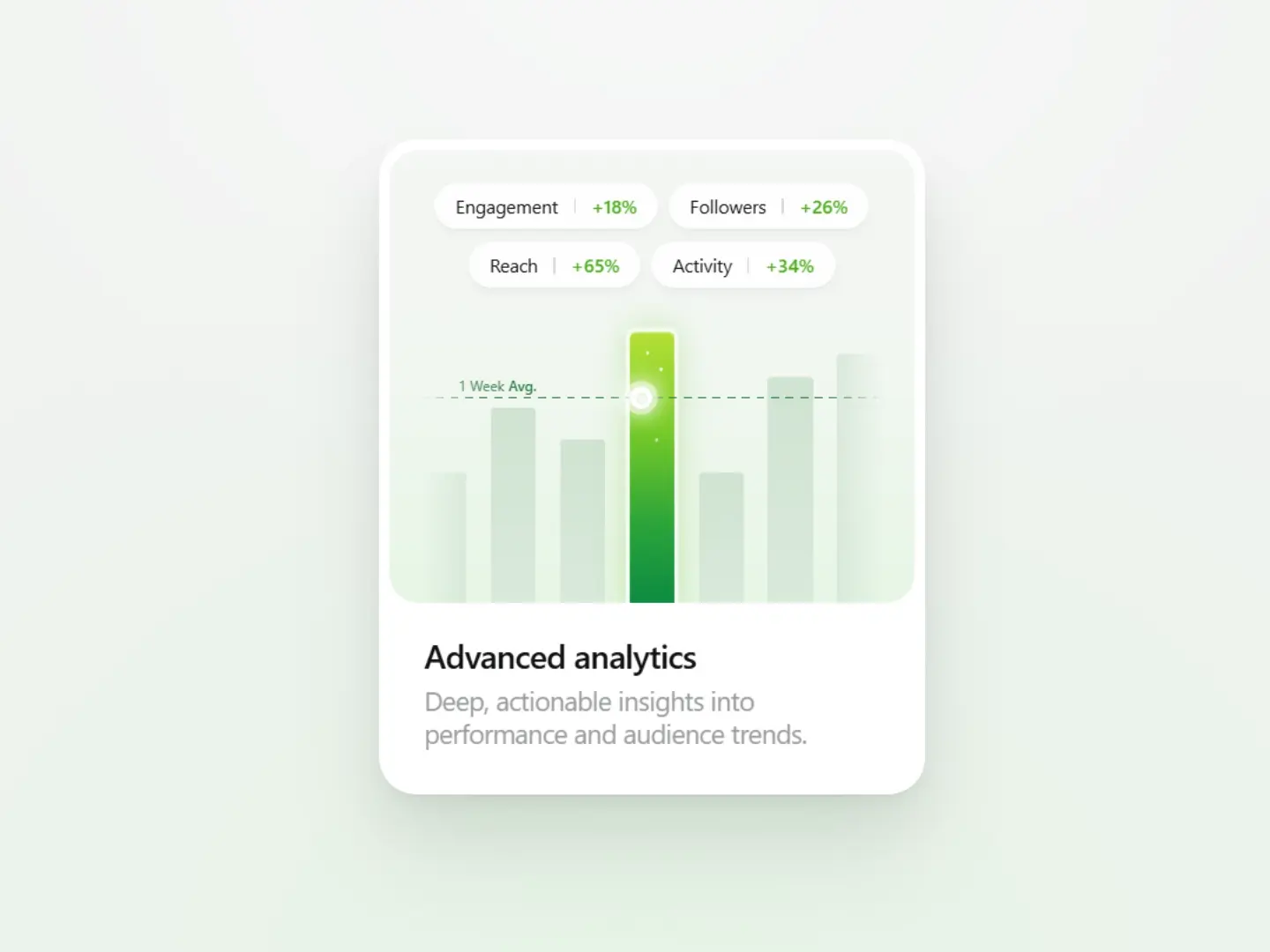
Minimal bar chart with a vibrant green featured peak bar Dashed 1 Week Avg. line that draws itself across the chart Glowing white node that pulses where the line meets the peak Four metric pills (Engagement, Followers, Reach, Activity) that stagger in Hover scales the active bar and lowers the opacity of the others Pills lift with a gentle glow on hover Responsive layout, zero dependencies