Data Security Glass Card
CodeFree
import React, { useMemo } from 'react';

/**
 * FrostedGlassGrid
 * A reusable frosted-glass tile pattern with animated gradient blobs behind it.
 *
 * @param {string[]} colors       - 3-4 hex colors for the gradient blobs
 * @param {number}   rows         - number of tile rows
 * @param {number}   cols         - number of tile columns
 * @param {number}   animationSpeed - base loop duration in seconds
 * @param {string}   className    - extra classes on the section
 */
const FrostedGlassGrid = ({
  colors = ['#38BDF8', '#6366F1', '#A78BFA', '#E0F2FE'],
  rows = 5,
  cols = 7,
  animationSpeed = 25,
  className = '',
}) => {
  // Pre-compute per-tile micro-variations so the grid feels organic
  const tiles = useMemo(() => {
    const result = [];
    for (let r = 0; r < rows; r++) {
      for (let c = 0; c < cols; c++) {
        result.push({
          id: `${r}-${c}`,
          opacity: 0.6 + Math.random() * 0.4,
          brightness: 0.92 + Math.random() * 0.16,
        });
      }
    }
    return result;
  }, [rows, cols]);

  // Blob definitions — positioned to concentrate color in the lower-center
  const blobs = useMemo(
    () => [
      { color: colors[0], x: '22%', y: '62%', size: '40%', dur: animationSpeed, delay: 0 },
      { color: colors[1], x: '58%', y: '70%', size: '36%', dur: animationSpeed * 1.15, delay: -6 },
      { color: colors[2], x: '40%', y: '52%', size: '44%', dur: animationSpeed * 0.95, delay: -12 },
      { color: colors[3], x: '70%', y: '58%', size: '30%', dur: animationSpeed * 1.1, delay: -18 },
    ],
    [colors, animationSpeed]
  );

  return (
    <section
      className={`relative w-full min-h-screen bg-white overflow-hidden ${className}`}
    >
      {/* ── Animated gradient blobs (single shared layer) ── */}
      <div className="absolute inset-0 overflow-hidden pointer-events-none">
        {blobs.map((b, i) => (
          <div
            key={i}
            className="blob absolute rounded-full blur-3xl"
            style={{
              backgroundColor: b.color,
              width: b.size,
              height: b.size,
              left: b.x,
              top: b.y,
              opacity: 0.55,
              animation: `blobDrift${i} ${b.dur}s ease-in-out infinite`,
              animationDelay: `${b.delay}s`,
            }}
          />
        ))}
      </div>

      {/* ── Tile grid ── */}
      <div className="relative z-10 flex items-start justify-center min-h-screen pt-[14vh] pb-10 px-4">
        <div
          className="grid gap-[10px] w-full"
          style={{
            gridTemplateColumns: `repeat(${cols}, minmax(56px, 1fr))`,
            maxWidth: '920px',
            // Radial mask: strongest in lower-center, fades toward top & edges
            maskImage:
              'radial-gradient(ellipse 78% 68% at 50% 62%, rgba(0,0,0,1) 18%, rgba(0,0,0,0.55) 50%, rgba(0,0,0,0) 82%)',
            WebkitMaskImage:
              'radial-gradient(ellipse 78% 68% at 50% 62%, rgba(0,0,0,1) 18%, rgba(0,0,0,0.55) 50%, rgba(0,0,0,0) 82%)',
          }}
        >
          {tiles.map((tile) => (
            <div
              key={tile.id}
              className="tile aspect-square rounded-[20px] transition-all duration-300 ease-out hover:brightness-115 hover:-translate-y-[2px] cursor-default"
              style={{
                backgroundColor: 'rgba(255,255,255,0.13)',
                backdropFilter: 'blur(14px)',
                WebkitBackdropFilter: 'blur(14px)',
                border: '1px solid rgba(255,255,255,0.45)',
                // Top-left inner highlight + subtle inner shadow + faint outer glow
                boxShadow:
                  'inset 0 2px 5px rgba(255,255,255,0.65), inset 0 -1px 3px rgba(0,0,0,0.04), 0 3px 10px rgba(0,0,0,0.05)',
                opacity: tile.opacity,
                filter: `brightness(${tile.brightness})`,
              }}
            />
          ))}
        </div>
      </div>

      {/* ── Keyframes + reduced-motion ── */}
      <style>{`
        @keyframes blobDrift0 {
          0%,100% { transform: translate(0,0) scale(1); }
          33%     { transform: translate(9%,-13%) scale(1.09); }
          66%     { transform: translate(-7%,9%) scale(0.93); }
        }
        @keyframes blobDrift1 {
          0%,100% { transform: translate(0,0) scale(1); }
          33%     { transform: translate(-11%,9%) scale(1.11); }
          66%     { transform: translate(8%,-7%) scale(0.91); }
        }
        @keyframes blobDrift2 {
          0%,100% { transform: translate(0,0) scale(1); }
          33%     { transform: translate(7%,11%) scale(0.95); }
          66%     { transform: translate(-10%,-9%) scale(1.07); }
        }
        @keyframes blobDrift3 {
          0%,100% { transform: translate(0,0) scale(1); }
          33%     { transform: translate(-8%,-10%) scale(1.13); }
          66%     { transform: translate(11%,7%) scale(0.89); }
        }
        @media (prefers-reduced-motion: reduce) {
          .blob { animation: none !important; }
        }
      `}</style>
    </section>
  );
};

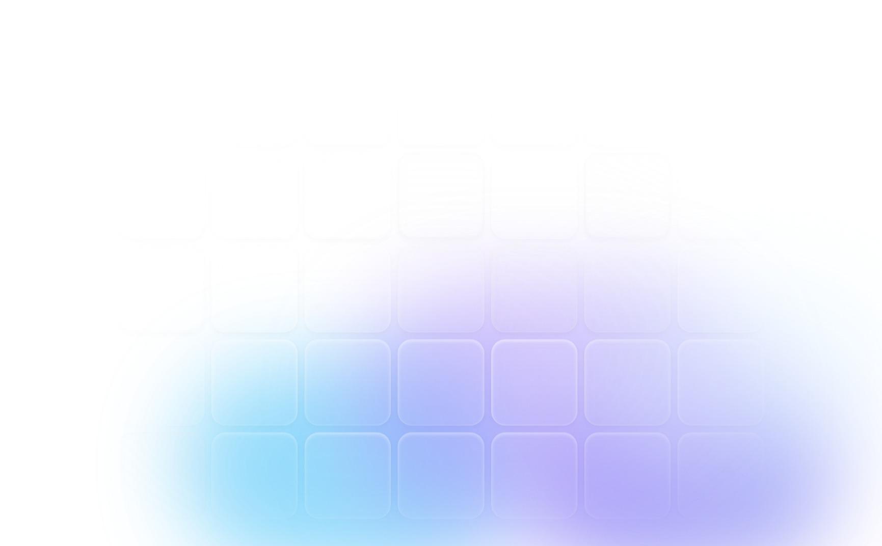
export default FrostedGlassGrid;A calm, animated frosted-glass tile pattern with a slow-moving ocean gradient.
Grid of rounded glass tiles with soft blur and light edges. Slow gradient flows behind the tiles in blue, indigo, and violet. Edges fade into the page so it blends with any section. Ocean Night palette: sky blue, indigo, violet, and pale ice. No text or labels, so it works as a pure visual background. Subtle hover lift on each tile. Easy to customize: colors, rows, columns and speed. Fully responsive, and motion pauses for reduced-motion users. Built with React and Tailwind CSS. Best on light or white backgrounds.
Instructions:
Copy the component into your project, for example: FrostedGlassGrid.jsx. Import it and place it as a section background:
import FrostedGlassGrid from "./FrostedGlassGrid";
<FrostedGlassGrid />