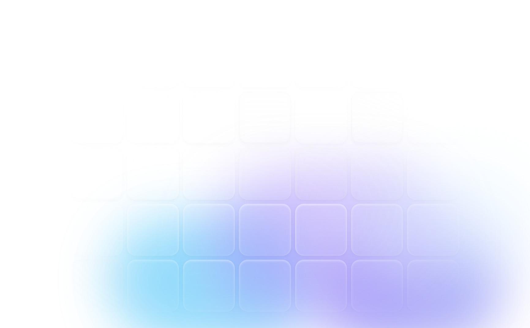
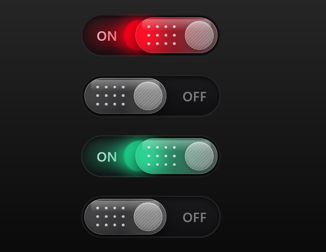
Frosted Glass Grid
CodeFree
import { useState } from "react";
import { motion, useReducedMotion } from "framer-motion";

/**
 * GlassToggle
 * A frosted-glass switch with a glowing orb, dot-grid grip and a striped knob.
 *
 * Requires: react, framer-motion, tailwindcss
 *
 * Props
 *  - variant:        "ember" | "ocean" | "mint" | "violet"   (default "ember")
 *  - checked:        controlled value
 *  - defaultChecked: uncontrolled initial value (default true)
 *  - onChange:       (checked: boolean) => void
 *  - disabled:       boolean
 *  - className:      extra classes for the outer button
 */

// Accent colours as "r,g,b" so we can build rgba() with any alpha.
const VARIANTS = {
  ember: "255,110,10", // original orange
  ocean: "20,140,255",
  mint: "30,210,140",
  violet: "150,90,255",
};

const OFF_ACCENT = "130,130,140";

const TRACK_W = 360;
const TRACK_H = 108;
const THUMB_W = 212;
const THUMB_H = 92;
const PAD = (TRACK_H - THUMB_H) / 2;
const TRAVEL = TRACK_W - THUMB_W - PAD * 2;

export default function GlassToggle({
  variant = "ember",
  checked,
  defaultChecked = true,
  onChange,
  disabled = false,
  className = "",
}) {
  const reduce = useReducedMotion();
  const [inner, setInner] = useState(defaultChecked);
  const isControlled = checked !== undefined;
  const on = isControlled ? checked : inner;

  const accent = VARIANTS[variant] ?? VARIANTS.ember;
  const a = (alpha) => `rgba(${accent},${alpha})`;

  const toggle = () => {
    if (disabled) return;
    const next = !on;
    if (!isControlled) setInner(next);
    onChange?.(next);
  };

  const spring = reduce
    ? { duration: 0 }
    : { type: "spring", stiffness: 260, damping: 26, mass: 0.9 };
  const fade = reduce ? { duration: 0 } : { duration: 0.35, ease: "easeOut" };

  return (
    <motion.button
      type="button"
      role="switch"
      aria-checked={on}
      aria-label={on ? "On" : "Off"}
      disabled={disabled}
      onClick={toggle}
      whileTap={disabled || reduce ? undefined : { scale: 0.97 }}
      transition={{ type: "spring", stiffness: 400, damping: 25 }}
      className={`relative block shrink-0 cursor-pointer rounded-full outline-none
        focus-visible:ring-2 focus-visible:ring-white/60 focus-visible:ring-offset-4
        focus-visible:ring-offset-neutral-900 disabled:cursor-not-allowed disabled:opacity-50 ${className}`}
      style={{ width: TRACK_W, height: TRACK_H }}
    >
      {/* Track */}
      <div
        className="absolute inset-0 overflow-hidden rounded-full"
        style={{
          background: "linear-gradient(180deg,#1b1b1e 0%,#0f0f11 100%)",
          boxShadow:
            "inset 0 0 0 3px rgba(255,255,255,0.10), inset 0 6px 14px rgba(0,0,0,0.75), 0 1px 0 rgba(255,255,255,0.06)",
        }}
      >
        {/* State labels */}
        <motion.span
          aria-hidden
          className="absolute left-10 top-1/2 -translate-y-1/2 select-none text-[34px] font-semibold tracking-wide text-white/90"
          animate={{ opacity: on ? 1 : 0 }}
          transition={fade}
        >
          ON
        </motion.span>
        <motion.span
          aria-hidden
          className="absolute right-9 top-1/2 -translate-y-1/2 select-none text-[34px] font-semibold tracking-wide text-white/45"
          animate={{ opacity: on ? 0 : 1 }}
          transition={fade}
        >
          OFF
        </motion.span>

        {/* Moving group: glow + orb + glass thumb travel together */}
        <motion.div
          className="absolute"
          style={{ left: PAD, top: PAD, width: THUMB_W, height: THUMB_H }}
          initial={false}
          animate={{ x: on ? TRAVEL : 0 }}
          transition={spring}
        >
          {/* Light trail */}
          <motion.div
            aria-hidden
            className="absolute top-1/2 -translate-y-1/2 rounded-full"
            style={{
              left: -150,
              width: 220,
              height: 64,
              background: `linear-gradient(90deg, ${a(0)} 0%, ${a(0.55)} 55%, ${a(0.95)} 100%)`,
              filter: "blur(16px)",
            }}
            animate={{ opacity: on ? 1 : 0 }}
            transition={fade}
          />

          {/* Orb */}
          <motion.div
            aria-hidden
            className="absolute top-1/2 -translate-y-1/2 rounded-full"
            style={{
              left: -30,
              width: 80,
              height: 80,
              background: `radial-gradient(circle at 40% 35%, ${a(1)} 0%, ${a(0.75)} 65%, ${a(0.5)} 100%)`,
              boxShadow: `0 0 36px 6px ${a(0.65)}`,
              filter: "blur(1.5px)",
            }}
            animate={{ opacity: on ? 1 : 0, scale: on ? 1 : 0.85 }}
            transition={fade}
          />

          {/* Glass body */}
          <div
            className="absolute inset-0 overflow-hidden rounded-full backdrop-blur-md"
            style={{
              background:
                "linear-gradient(100deg, rgba(255,255,255,0.22) 0%, rgba(255,255,255,0.14) 50%, rgba(255,255,255,0.34) 100%)",
              border: "1px solid rgba(255,255,255,0.38)",
              boxShadow:
                "inset 0 1px 0 rgba(255,255,255,0.55), inset 0 -10px 18px rgba(0,0,0,0.18), 0 12px 28px rgba(0,0,0,0.5)",
            }}
          >
            {/* Accent tint */}
            <motion.div
              aria-hidden
              className="absolute inset-0"
              style={{
                background: `linear-gradient(100deg, ${a(0.75)} 0%, ${a(0.45)} 50%, ${a(0.05)} 100%)`,
              }}
              animate={{ opacity: on ? 1 : 0 }}
              transition={fade}
            />

            {/* Top sheen */}
            <div
              aria-hidden
              className="absolute inset-x-4 top-1 h-1/3 rounded-full"
              style={{
                background:
                  "linear-gradient(180deg, rgba(255,255,255,0.35), rgba(255,255,255,0))",
              }}
            />

            {/* Dot grid grip */}
            <div
              aria-hidden
              className="absolute top-1/2 grid -translate-y-1/2 grid-cols-4 gap-[14px]"
              style={{ left: 30 }}
            >
              {Array.from({ length: 12 }).map((_, i) => (
                <span
                  key={i}
                  className="block h-2 w-2 rounded-full"
                  style={{
                    background:
                      "radial-gradient(circle at 35% 30%, rgba(255,255,255,0.85), rgba(255,255,255,0.35))",
                    boxShadow:
                      "inset 0 -1px 1px rgba(0,0,0,0.25), 0 1px 2px rgba(0,0,0,0.3)",
                  }}
                />
              ))}
            </div>

            {/* Striped knob */}
            <div
              aria-hidden
              className="absolute top-1/2 -translate-y-1/2 rounded-full"
              style={{
                right: 10,
                width: 74,
                height: 74,
                background:
                  "repeating-linear-gradient(135deg, rgba(255,255,255,0.20) 0 2px, rgba(255,255,255,0.04) 2px 6px), linear-gradient(145deg, rgba(255,255,255,0.42), rgba(255,255,255,0.18))",
                border: "1px solid rgba(255,255,255,0.45)",
                boxShadow:
                  "inset 0 2px 3px rgba(255,255,255,0.45), inset 0 -4px 8px rgba(0,0,0,0.15), 0 4px 10px rgba(0,0,0,0.25)",
              }}
            />
          </div>
        </motion.div>
      </div>
    </motion.button>
  );
}

/* ---------- Demo: all variants on a dark surface ---------- */
export function GlassToggleDemo() {
  return (
    <div className="flex min-h-screen flex-col items-center justify-center gap-12 bg-gradient-to-b from-neutral-800 to-neutral-950 p-10">
      <GlassToggle variant="ember" />
      <GlassToggle variant="ocean" />
      <GlassToggle variant="mint" />
      <GlassToggle variant="violet" />
    </div>
  );
}A frosted-glass toggle switch with a glowing orb and smooth spring motion.
Frosted glass thumb with a soft blur. Glowing orb and light trail that follow the thumb. Dot grid grip and a striped round knob. Four color variants: ember, ocean, mint and violet. Works as a controlled or uncontrolled component. Accessible: keyboard support, role="switch" and a focus ring. Respects reduced-motion settings. Built with React, Tailwind CSS, and Framer Motion. Best on dark backgrounds.
Instructions
Install the dependency: npm install framer-motion Copy the component into your project, for example: GlassToggle.jsx. Import it and pick a color:
import GlassToggle from "./GlassToggle";
<GlassToggle variant="ocean" />
For controlled use, pass checked and onChange: <GlassToggle variant="mint" checked={value} onChange={setValue} />
Place it on a dark background so the glass and glow show up.