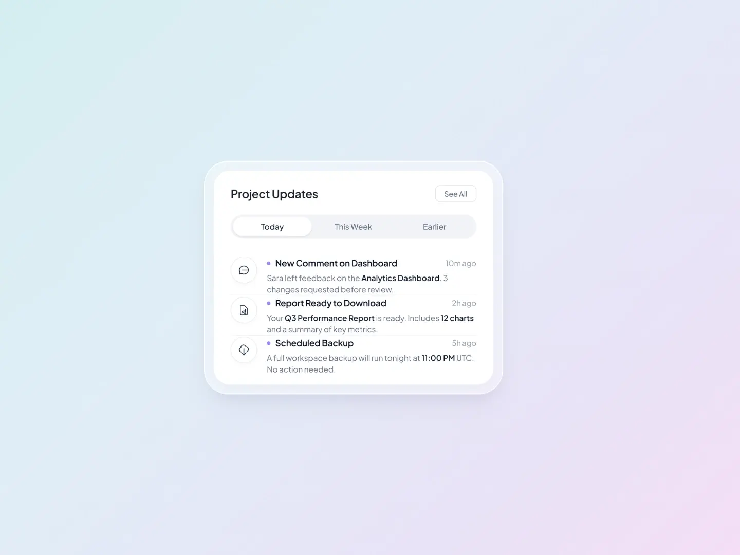
AI Notification UI Card
FramerFree
<!DOCTYPE html>
<html lang="en">
<head>
<meta charset="UTF-8">
<meta name="viewport" content="width=device-width, initial-scale=1">
<title>Measure Product Momentum</title>
<style>
:root {
--bg: #f8f9fa;
--ink: #0e1013;
--muted: #70757e;
--violet: #6d28d9;
--magenta: #c026d3;
--emerald: #10b981;
--ease: cubic-bezier(0.22, 1, 0.36, 1);
}
* { box-sizing: border-box; margin: 0; padding: 0; }
html, body { height: 100%; }
body {
min-height: 100vh;
display: grid;
place-items: center;
padding: 24px;
background: var(--bg);
font-family: "Inter", system-ui, -apple-system, "Segoe UI", Roboto, sans-serif;
color: var(--ink);
-webkit-font-smoothing: antialiased;
}
/* ---------- Card ---------- */
.card {
position: relative;
width: min(540px, 80%);
aspect-ratio: 540 / 480;
border-radius: 32px;
background: #fff;
overflow: hidden;
box-shadow:
0 1px 2px rgba(20, 22, 40, 0.04),
0 8px 18px rgba(20, 22, 40, 0.04),
0 28px 56px rgba(20, 22, 40, 0.07),
0 60px 110px rgba(60, 30, 110, 0.08);
opacity: 0;
transform: translateY(22px) scale(0.975);
animation: cardIn 1s var(--ease) 0.05s forwards;
}
@keyframes cardIn { to { opacity: 1; transform: none; } }
.copy { position: relative; z-index: 3; padding: 7% 6.2% 0; }
.copy h1 {
font-size: clamp(26px, 6.6vw, 32px);
font-weight: 600;
letter-spacing: -0.035em;
line-height: 1.08;
}
.copy p {
margin-top: 12px;
max-width: 25em;
font-size: clamp(16px, 4.2vw, 22px);
line-height: 1.28;
letter-spacing: -0.018em;
color: var(--muted);
}
.copy h1, .copy p { opacity: 0; transform: translateY(10px); animation: textIn 0.9s var(--ease) forwards; }
.copy h1 { animation-delay: 0.25s; }
.copy p { animation-delay: 0.38s; }
@keyframes textIn { to { opacity: 1; transform: none; } }
/* ---------- Floating badges ---------- */
.slot {
position: absolute;
z-index: 4;
opacity: 0;
animation: slotIn 1.1s linear forwards;
}
.slot.left { left: 5.5%; top: 49%; animation-delay: 0.75s; }
.slot.right { right: 4.5%; top: 44%; animation-delay: 0.9s; }
@keyframes slotIn {
0% { opacity: 0; transform: translateY(30px) scale(0.9); animation-timing-function: cubic-bezier(0.2, 0.9, 0.3, 1); }
55% { opacity: 1; transform: translateY(-9px) scale(1.03); animation-timing-function: cubic-bezier(0.4, 0, 0.3, 1); }
78% { opacity: 1; transform: translateY(3px) scale(0.995); animation-timing-function: ease-out; }
100% { opacity: 1; transform: none; }
}
.float { animation: bob 5.2s ease-in-out infinite alternate; }
.slot.left .float { animation-delay: 2s; }
.slot.right .float { animation-delay: 3.2s; animation-duration: 6s; }
@keyframes bob { from { transform: translateY(0); } to { transform: translateY(-5px); } }
.badge {
--r: -6deg;
display: flex; align-items: center; gap: 10px;
padding: 10px 11px 10px 16px;
border-radius: 15px;
background: linear-gradient(180deg, #ffffff, #fbfbfd);
border: 1px solid rgba(20, 22, 40, 0.05);
font-size: clamp(13px, 3.4vw, 16px);
font-weight: 500;
letter-spacing: -0.015em;
white-space: nowrap;
cursor: default;
transform: rotate(var(--r));
box-shadow:
0 1px 2px rgba(20, 22, 40, 0.05),
0 8px 16px var(--glow),
0 18px 34px rgba(20, 22, 40, 0.07),
inset 0 1px 0 #fff;
transition: transform 0.7s var(--ease), box-shadow 0.5s ease;
}
.slot.left .badge { --r: -6.5deg; --glow: rgba(109, 40, 217, 0.14); }
.slot.right .badge { --r: 5.5deg; --glow: rgba(16, 185, 129, 0.16); }
.card:hover .badge { transform: rotate(0deg) translateY(-5px); }
.card .badge:hover { transform: rotate(0deg) translateY(-8px) scale(1.05); }
.chip {
display: inline-flex; align-items: center; gap: 3px;
padding: 5px 10px;
border-radius: 999px;
font-size: 0.82em;
font-weight: 600;
letter-spacing: -0.01em;
}
.chip.v { background: #ede9fe; color: #6d28d9; box-shadow: inset 0 0 0 1px rgba(109,40,217,0.12); }
.chip.e { background: #d1fae5; color: #047857; box-shadow: inset 0 0 0 1px rgba(16,185,129,0.18); }
/* ---------- Gauge ---------- */
.gauge {
position: absolute;
left: 50%; bottom: 0;
width: 82%;
transform: translateX(-50%);
z-index: 2;
display: block;
overflow: visible;
}
.halo1, .halo2 { opacity: 0; animation: haloIn 1.4s var(--ease) 0.35s forwards; }
.halo2 { animation-delay: 0.5s; }
@keyframes haloIn { to { opacity: 1; } }
.seg .lit { opacity: 0; transition: opacity 0.55s var(--ease); }
.seg.on .lit { opacity: 1; }
.lit-wrap { filter: drop-shadow(0 4px 7px rgba(150, 40, 200, 0.28)); }
.needle { filter: drop-shadow(0 3px 4px rgba(70, 20, 120, 0.3)); }
@media (prefers-reduced-motion: reduce) {
.float { animation: none; }
}
</style>
</head>
<body>
<main class="card" id="card" aria-label="Product momentum dashboard">
<header class="copy">
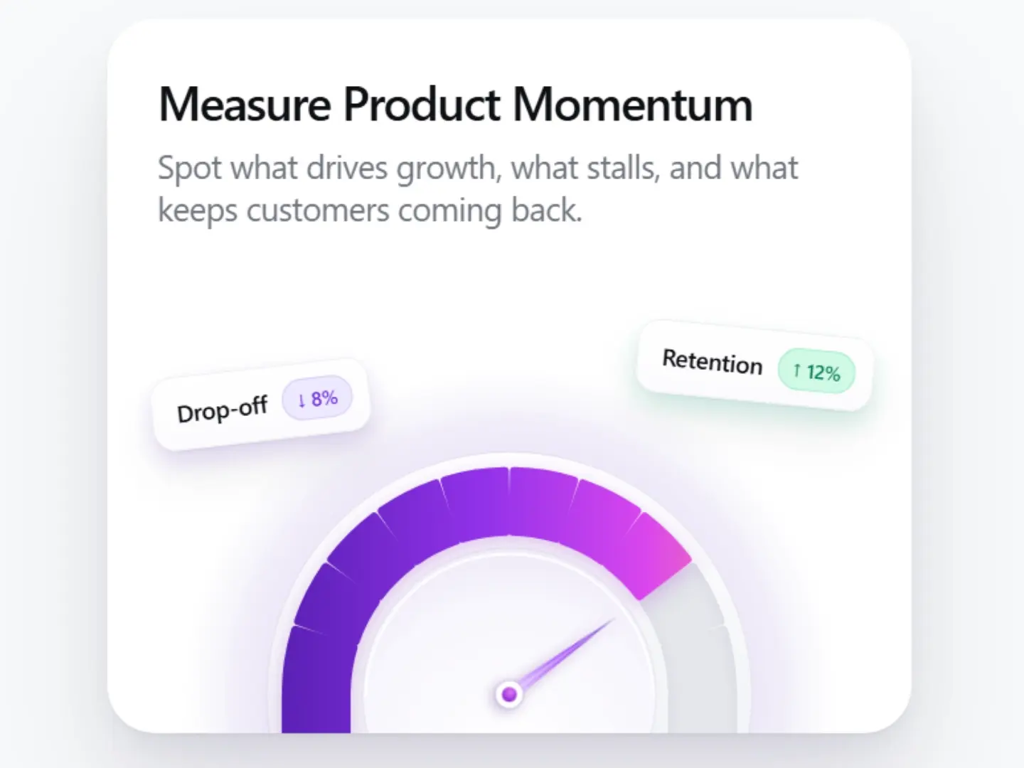
<h1>Measure Product Momentum</h1>
<p>Spot what drives growth, what stalls, and what keeps customers coming back.</p>
</header>
<div class="slot left"><div class="float">
<div class="badge"><span>Drop-off</span><span class="chip v">↓ 8%</span></div>
</div></div>
<div class="slot right"><div class="float">
<div class="badge"><span>Retention</span><span class="chip e">↑ 12%</span></div>
</div></div>
<svg class="gauge" id="gauge" viewBox="0 0 440 244" role="img" aria-label="Gauge showing 80 percent">
<defs>
<linearGradient id="active" gradientUnits="userSpaceOnUse" x1="70" y1="0" x2="370" y2="0">
<stop offset="0" stop-color="#5b21b6"/>
<stop offset="0.45" stop-color="#9333ea"/>
<stop offset="0.8" stop-color="#d946ef"/>
<stop offset="1" stop-color="#f472b6"/>
</linearGradient>
<radialGradient id="haloA" cx="50%" cy="50%" r="50%">
<stop offset="0.72" stop-color="#e9e5f5" stop-opacity="0.9"/>
<stop offset="1" stop-color="#e9e5f5" stop-opacity="0"/>
</radialGradient>
<radialGradient id="haloB" cx="50%" cy="50%" r="50%">
<stop offset="0.8" stop-color="#efeaf9" stop-opacity="0.95"/>
<stop offset="1" stop-color="#efeaf9" stop-opacity="0.2"/>
</radialGradient>
<linearGradient id="bezel" x1="0" y1="0" x2="0" y2="1">
<stop offset="0" stop-color="#ffffff"/>
<stop offset="1" stop-color="#e9ebf0"/>
</linearGradient>
<radialGradient id="dish" cx="50%" cy="70%" r="75%">
<stop offset="0" stop-color="#ffffff"/>
<stop offset="0.7" stop-color="#f8f6fd"/>
<stop offset="1" stop-color="#ece8f6"/>
</radialGradient>
<linearGradient id="needleG" x1="0" y1="1" x2="0" y2="0">
<stop offset="0" stop-color="#e9d5ff"/>
<stop offset="0.55" stop-color="#a855f7"/>
<stop offset="1" stop-color="#5b21b6"/>
</linearGradient>
<radialGradient id="pivotG" cx="40%" cy="35%" r="70%">
<stop offset="0" stop-color="#e879f9"/>
<stop offset="1" stop-color="#7e22ce"/>
</radialGradient>
<filter id="inner" x="-20%" y="-20%" width="140%" height="140%">
<feOffset dy="3"/><feGaussianBlur stdDeviation="4" result="b"/>
<feComposite in="SourceGraphic" in2="b" operator="out" result="o"/>
<feFlood flood-color="#6d5aa8" flood-opacity="0.16"/><feComposite in2="o" operator="in" result="s"/>
<feMerge><feMergeNode in="SourceGraphic"/><feMergeNode in="s"/></feMerge>
</filter>
</defs>
<circle class="halo1" cx="220" cy="218" r="218" fill="url(#haloA)"/>
<circle class="halo2" cx="220" cy="218" r="190" fill="url(#haloB)"/>
<circle cx="220" cy="218" r="162" fill="url(#bezel)" stroke="rgba(30,30,60,0.05)"/>
<g id="track" filter="url(#inner)"></g>
<g class="lit-wrap" id="litLayer"></g>
<circle cx="220" cy="218" r="98" fill="url(#dish)" stroke="rgba(30,30,60,0.06)"/>
<path d="M124 218 A96 96 0 0 1 316 218" fill="none" stroke="#fff" stroke-width="2" opacity="0.9" transform="translate(0 2)"/>
<g class="needle" id="needle" transform="translate(220 218) rotate(-90)">
<path d="M-4.6 0 L0 -88 L4.6 0 Z" fill="url(#needleG)"/>
<path d="M0 -86 L0 -4" stroke="#fff" stroke-opacity="0.55" stroke-width="1"/>
<circle r="9.5" fill="#fff"/>
<circle r="9.5" fill="none" stroke="rgba(90,40,160,0.18)"/>
<circle r="5" fill="url(#pivotG)"/>
</g>
</svg>
</main>
<script>
(function () {
const TARGET = 0.8; // needle stops at exactly 80%
const DURATION = 2800; // sweep duration (ms)
const DELAY = 1100; // wait for card + badges to arrive
const reduce = matchMedia('(prefers-reduced-motion: reduce)').matches;
const NS = 'http://www.w3.org/2000/svg';
const CX = 220, CY = 218, BOTTOM = 244;
const R_OUT = 152, R_IN = 106, SEGMENTS = 10, GAP = 2.6, PAD = 3;
const track = document.getElementById('track');
const litLayer = document.getElementById('litLayer');
const needle = document.getElementById('needle');
const card = document.getElementById('card');
const pt = (r, f) => { // f: 0 (left) .. 1 (right)
const a = Math.PI * (1 - f);
return [CX + r * Math.cos(a), CY - r * Math.sin(a)];
};
function segPath(i, ro, ri) {
const span = 1 / SEGMENTS;
const gapF = GAP / 180;
const f0 = i * span + gapF / 2, f1 = (i + 1) * span - gapF / 2;
const [ox0, oy0] = pt(ro, f0), [ox1, oy1] = pt(ro, f1);
const [ix1, iy1] = pt(ri, f1), [ix0, iy0] = pt(ri, f0);
return 'M' + ox0 + ' ' + oy0 +
' A' + ro + ' ' + ro + ' 0 0 1 ' + ox1 + ' ' + oy1 +
' L' + ix1 + ' ' + iy1 +
' A' + ri + ' ' + ri + ' 0 0 0 ' + ix0 + ' ' + iy0 + ' Z';
}
function shape(d, fill, rect) {
const el = document.createElementNS(NS, rect ? 'rect' : 'path');
if (rect) { Object.entries(d).forEach(([k, v]) => el.setAttribute(k, v)); }
else el.setAttribute('d', d);
el.setAttribute('fill', fill);
el.setAttribute('stroke', fill);
el.setAttribute('stroke-width', PAD * 2);
el.setAttribute('stroke-linejoin', 'round');
return el;
}
const segs = [];
for (let i = 0; i < SEGMENTS; i++) {
const d = segPath(i, R_OUT - PAD, R_IN + PAD);
track.appendChild(shape(d, '#e4e6eb'));
const g = document.createElementNS(NS, 'g');
g.setAttribute('class', 'seg');
g.appendChild(shape(d, 'url(#active)')).setAttribute('class', 'lit');
// straight walls below the pivot line for the first and last segment
if (i === 0) {
track.appendChild(shape({ x: CX - R_OUT + PAD, y: CY, width: R_OUT - R_IN - PAD * 2, height: BOTTOM - CY }, '#e4e6eb', true));
g.appendChild(shape({ x: CX - R_OUT + PAD, y: CY, width: R_OUT - R_IN - PAD * 2, height: BOTTOM - CY }, 'url(#active)', true)).setAttribute('class', 'lit');
}
if (i === SEGMENTS - 1) {
track.appendChild(shape({ x: CX + R_IN + PAD, y: CY, width: R_OUT - R_IN - PAD * 2, height: BOTTOM - CY }, '#e4e6eb', true));
g.appendChild(shape({ x: CX + R_IN + PAD, y: CY, width: R_OUT - R_IN - PAD * 2, height: BOTTOM - CY }, 'url(#active)', true)).setAttribute('class', 'lit');
}
litLayer.appendChild(g);
segs.push({ g, mid: (i + 0.5) / SEGMENTS, on: false });
}
// cubic-bezier solver
function bezier(x1, y1, x2, y2) {
return t => {
if (t <= 0) return 0; if (t >= 1) return 1;
let lo = 0, hi = 1, u = t;
for (let i = 0; i < 28; i++) {
const x = 3*(1-u)*(1-u)*u*x1 + 3*(1-u)*u*u*x2 + u*u*u;
if (x < t) lo = u; else hi = u;
u = (lo + hi) / 2;
}
return 3*(1-u)*(1-u)*u*y1 + 3*(1-u)*u*u*y2 + u*u*u;
};
}
const ease = bezier(0.25, 1, 0.5, 1);
let value = 0, twitchStart = -1, t0 = 0, settled = false;
function render() {
const twitch = twitchStart < 0 ? 0 :
(() => {
const s = (performance.now() - twitchStart) / 1000;
if (s > 0.9) { twitchStart = -1; return 0; }
return 5 * Math.exp(-s * 6.5) * Math.sin(s * 30);
})();
needle.setAttribute('transform', 'translate(' + CX + ' ' + CY + ') rotate(' + (-90 + value * 180 + twitch).toFixed(3) + ')');
segs.forEach(s => {
const on = value >= s.mid - 0.0001;
if (on !== s.on) { s.on = on; s.g.classList.toggle('on', on); }
});
}
function frame(now) {
if (!settled) {
const raw = reduce ? 1 : Math.min(1, Math.max(0, (now - t0) / DURATION));
value = TARGET * ease(raw);
if (raw >= 1) { value = TARGET; settled = true; }
}
render();
requestAnimationFrame(frame);
}
function twitch() {
if (!settled || twitchStart > 0 && performance.now() - twitchStart < 700) return;
twitchStart = performance.now();
}
card.addEventListener('mouseenter', twitch);
card.querySelectorAll('.badge').forEach(b => b.addEventListener('mouseenter', twitch));
t0 = performance.now() + DELAY;
requestAnimationFrame(frame);
})();
</script>
</body>
</html>What’s inside
Precision needle with a custom deceleration curve, like a physical instrument Layered gauge with soft halos, a beveled ring, and a clean pivot dot Segments light up one by one as the needle passes them Two tilted metric badges (Drop-off and Retention) with trend arrows Hover levels out the badges and gives the needle a small twitch Responsive layout, zero dependencies