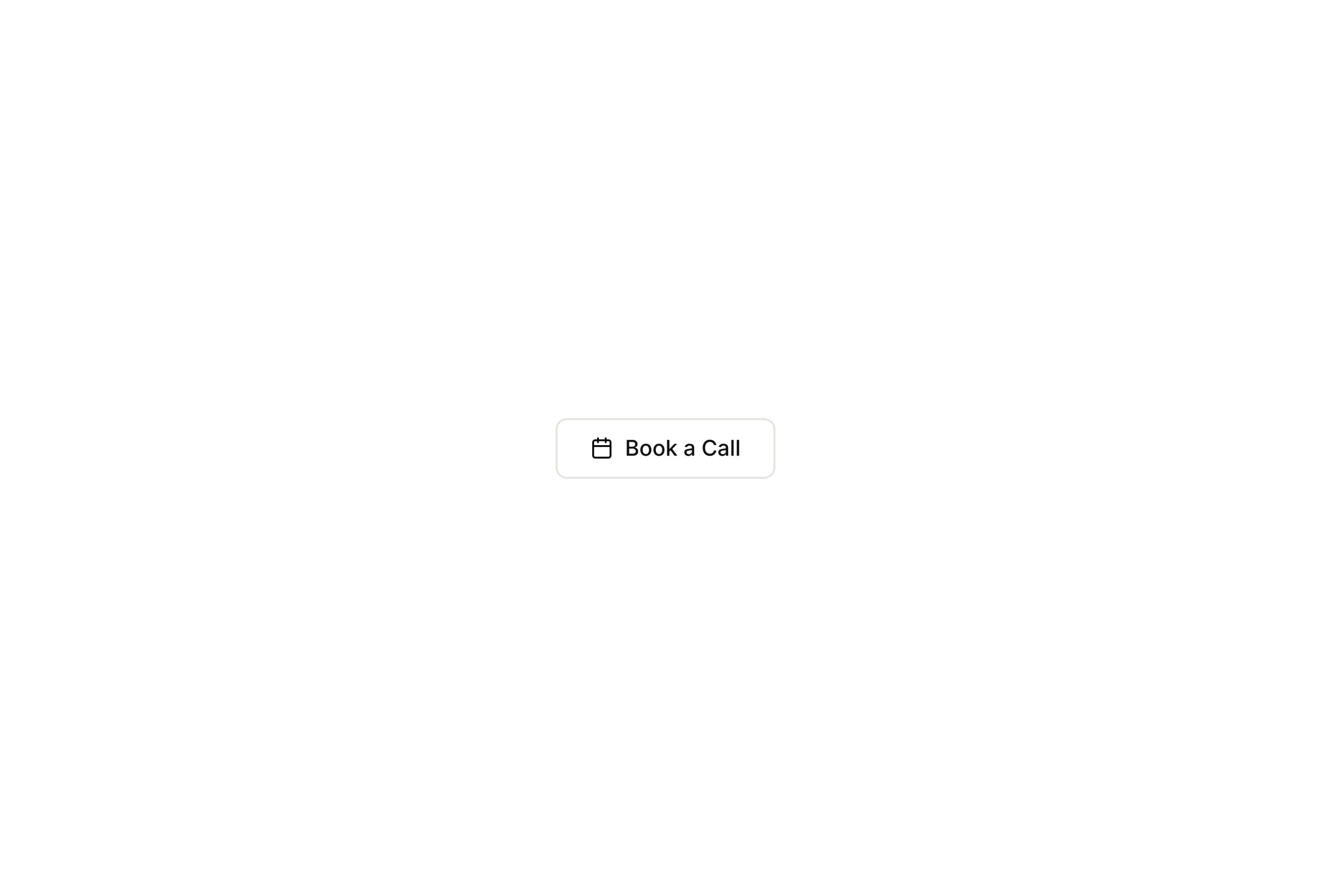
Outlined Calendar Button
FramerFree
<!DOCTYPE html>
<html lang="en">
<head>
  <meta charset="UTF-8">
  <meta name="viewport" content="width=device-width, initial-scale=1.0">
  <title>Glossy Polka Pill Button</title>
  <link rel="stylesheet" href="style.css">
</head>
<body>

  <button class="glossy-pill-btn" type="button">
    <span class="btn-text">Explore</span>
  </button>

</body>
</html>Tactile 3D Glossy Button
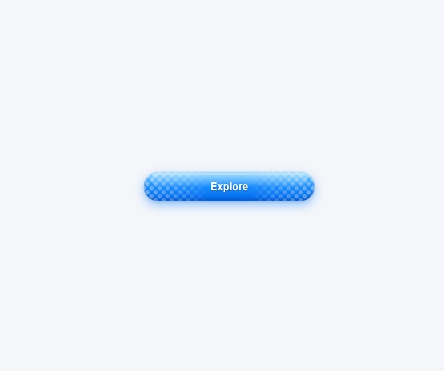
Features a smooth pill shape with a vibrant 3D gradient and a top light sheen. Includes staggered polka-dot patterns on both sides that fade toward the center. Responds with a gentle lift on hover and a realistic press effect when clicked. Built with pure HTML and CSS variables for quick color and label customization.