
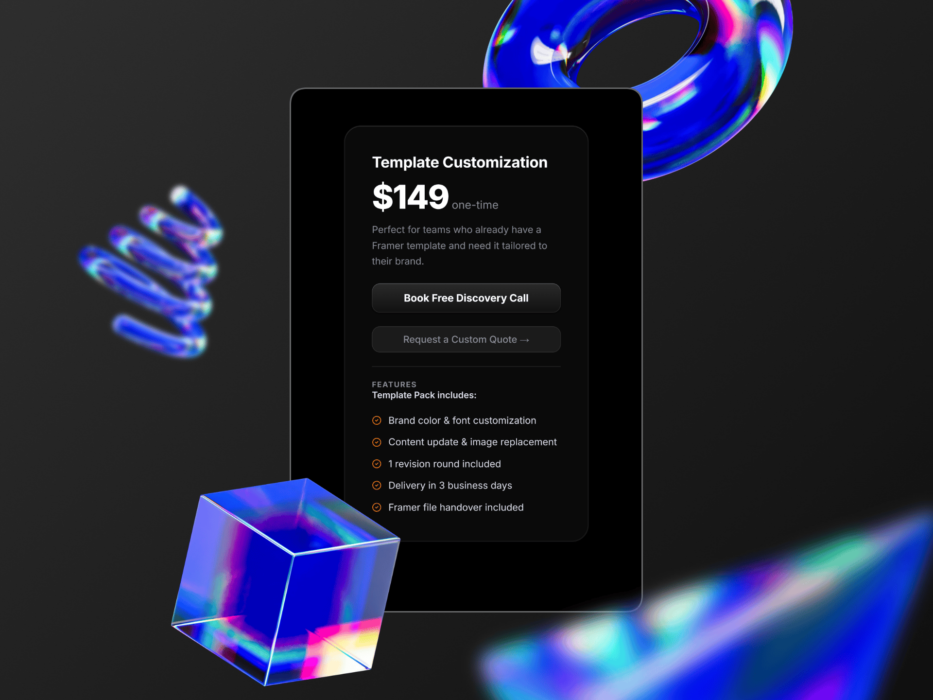
Premium Dark Pricing Card
FramerFree

<!doctype html>
<html lang="en">
  <head>
    <meta charset="UTF-8" />
    <meta name="viewport" content="width=device-width, initial-scale=1" />
    <title>Premium Service. Premium Websites.</title>
    <style>
      @import url("https://fonts.googleapis.com/css2?family=Poppins:ital,wght@0,100;0,200;0,300;0,400;0,500;0,600;0,700;0,800;0,900;1,100;1,200;1,300;1,400;1,500;1,600;1,700;1,800;1,900&display=swap");
      :root {
        --bg: #f5f5f7;
        --ink: #17171a;
        --mute: #9a9aa2;
        --body: #55555c;
        --line: rgba(20, 20, 40, 0.09);
        --acc: #6d3bff;
        --acc2: #9b7bff;
        --accglow: rgba(109, 59, 255, 0.35);
        --ease: cubic-bezier(0.22, 1, 0.36, 1);
      }
      * {
        box-sizing: border-box;
        margin: 0;
      }
      body {
        min-height: 100vh;
        display: grid;
        place-items: center;
        padding: 24px;
        background: linear-gradient(180deg, #f8f8fa, #e9e9ed);
        font-family:
        "Poppins";
        color: var(--ink);
        -webkit-font-smoothing: antialiased;
      }
      .board {
        position: relative;
        width: min(560px, 100%);
        border-radius: 44px;
        background: #fcfcfd;
        overflow: hidden;
        padding: 44px 0 56px;
        box-shadow:
          0 1px 0 #fff inset,
          0 0 0 1px var(--line),
          0 40px 80px -40px rgba(30, 30, 60, 0.3);
      }
      /* grid lines */
      .board::before {
        content: "";
        position: absolute;
        left: 0;
        right: 0;
        top: 205px;
        height: 1px;
        background: linear-gradient(
          90deg,
          transparent,
          var(--line) 15%,
          var(--line) 85%,
          transparent
        );
      }
      .board::after {
        content: "";
        position: absolute;
        top: 205px;
        bottom: 0;
        left: 22%;
        right: 22%;
        border-left: 1px solid rgba(20, 20, 40, 0.04);
        border-right: 1px solid rgba(20, 20, 40, 0.04);
        pointer-events: none;
      }
      .head {
        position: relative;
        z-index: 1;
        text-align: center;
        height: 161px;
      }
      .badge-row {
        display: flex;
        align-items: center;
        justify-content: center;
        gap: 16px;
      }
      .badge-row .ln {
        width: 44px;
        height: 1px;
        background: linear-gradient(90deg, transparent, var(--acc2));
      }
      .badge-row .ln:last-child {
        transform: scaleX(-1);
      }
      .badge {
        display: inline-flex;
        align-items: center;
        gap: 8px;
        padding: 8px 18px;
        border-radius: 999px;
        font-size: 14px;
        font-weight: 500;
        background: linear-gradient(#fff, #f6f4ff);
        border: 2px solid var(--acc);
        color: var(--ink);
        box-shadow:
          0 1px 0 #fff inset,
          0 8px 22px -6px var(--accglow);
        opacity: 0;
        transform: translateY(-30px);
        animation:
          drop 1s 0.1s var(--ease) forwards,
          glow 3s 1.2s ease-in-out infinite;
      }
      .badge svg {
        width: 14px;
        height: 14px;
        fill: var(--acc);
        animation: spin 6s linear infinite;
      }
      @keyframes drop {
        to {
          opacity: 1;
          transform: none;
        }
      }
      @keyframes glow {
        50% {
          box-shadow:
            0 1px 0 #fff inset,
            0 10px 34px -2px rgba(109, 59, 255, 0.6);
        }
      }
      @keyframes spin {
        to {
          transform: rotate(360deg);
        }
      }
      h1 {
        margin-top: 26px;
        font-size: clamp(34px, 8.6vw, 48px);
        font-weight: 500;
        letter-spacing: -0.035em;
        line-height: 1.02;
      }
      h1 span {
        display: block;
      }
      h1 span:last-child {
        color: #8e8e96;
      }
      .stack {
        position: relative;
        z-index: 1;
        width: min(404px, 86%);
        margin: 56px auto 0;
        perspective: 1000px;
      }
      .plate {
        padding: 14px;
        border-radius: 40px;
        background: linear-gradient(#efeff2, #e8e8ec);
        box-shadow:
          0 2px 3px rgba(0, 0, 0, 0.04) inset,
          0 30px 50px -20px rgba(40, 40, 70, 0.28);
        opacity: 0;
        transform: translateY(50px);
        animation: rise 1.1s 0.35s var(--ease) forwards;
      }
      @keyframes rise {
        to {
          opacity: 1;
          transform: none;
        }
      }
      .card,
      .addons {
        position: relative;
        background: linear-gradient(#fff, #f9f9fb);
        border-radius: 30px;
        box-shadow:
          0 1px 0 #fff inset,
          0 -3px 8px rgba(0, 0, 0, 0.025) inset,
          0 1px 2px rgba(30, 30, 60, 0.06),
          0 8px 16px -4px rgba(30, 30, 60, 0.08),
          0 24px 40px -12px rgba(30, 30, 60, 0.14);
        transform-style: preserve-3d;
        transition:
          transform 0.35s var(--ease),
          box-shadow 0.35s var(--ease);
        will-change: transform;
      }
      .card {
        padding: 30px 34px 28px;
      }
      .card.hover,
      .addons .cell.hover {
        box-shadow:
          0 1px 0 #fff inset,
          0 2px 4px rgba(30, 30, 60, 0.06),
          0 18px 30px -6px rgba(30, 30, 60, 0.14),
          0 44px 60px -16px rgba(30, 30, 60, 0.24);
      }
      .price {
        display: inline-block;
        font-size: 48px;
        font-weight: 600;
        letter-spacing: -0.03em;
        line-height: 1;
        color: var(--acc);
        transition:
          text-shadow 0.3s,
          color 0.3s,
          transform 0.3s var(--ease);
        cursor: default;
      }
      .price:hover {
        color: #8a5cff;
        text-shadow: 0 0 22px rgba(130, 90, 255, 0.55);
        transform: translateZ(30px) scale(1.03);
      }
      hr {
        border: 0;
        height: 1px;
        background: var(--line);
        margin: 22px 0 20px;
      }
      ul {
        list-style: none;
        padding: 0;
        display: grid;
        gap: 15px;
      }
      li {
        display: flex;
        align-items: center;
        gap: 14px;
        font-size: 17px;
        color: var(--body);
        letter-spacing: -0.01em;
      }
      .ico {
        flex: none;
        width: 28px;
        height: 28px;
        border-radius: 50%;
        display: grid;
        place-items: center;
        background: linear-gradient(#f1ebff, #e3d8ff);
        color: var(--acc);
        box-shadow:
          0 1px 0 #fff inset,
          0 3px 6px -1px var(--accglow);
        opacity: 0;
        transform: scale(0.4) translateX(-10px);
        transition:
          box-shadow 0.3s,
          background 0.3s,
          color 0.3s,
          transform 0.3s var(--ease);
      }
      .ico svg {
        width: 15px;
        height: 15px;
        fill: none;
        stroke: currentColor;
        stroke-width: 2;
        stroke-linecap: round;
        stroke-linejoin: round;
        stroke-dasharray: 60;
        stroke-dashoffset: 60;
      }
      .ready .ico {
        animation: pop 0.6s var(--ease) forwards;
        animation-delay: calc(0.9s + var(--i) * 0.09s);
      }
      .ready .ico svg {
        animation: draw 0.9s ease forwards;
        animation-delay: calc(1s + var(--i) * 0.09s);
      }
      @keyframes pop {
        to {
          opacity: 1;
          transform: none;
        }
      }
      @keyframes draw {
        to {
          stroke-dashoffset: 0;
        }
      }
      .ico:hover {
        background: linear-gradient(var(--acc2), var(--acc));
        color: #fff;
        box-shadow: 0 0 16px 2px rgba(130, 90, 255, 0.6);
        transform: scale(1.15) rotate(-6deg) !important;
      }
      .addons {
        margin-top: 14px;
        display: grid;
        grid-template-columns: 1fr 1fr;
        padding: 0;
        background: none;
        box-shadow: none;
        gap: 0;
        opacity: 0;
        transform: translateY(50px);
        animation: rise 1.1s 0.55s var(--ease) forwards;
      }
      .cell {
        background: linear-gradient(#fff, #f9f9fb);
        padding: 22px 0 22px 28px;
        box-shadow:
          0 1px 0 #fff inset,
          0 1px 2px rgba(30, 30, 60, 0.06),
          0 8px 16px -4px rgba(30, 30, 60, 0.08),
          0 20px 30px -12px rgba(30, 30, 60, 0.14);
        transition:
          transform 0.35s var(--ease),
          box-shadow 0.35s var(--ease);
        transform-style: preserve-3d;
        will-change: transform;
      }
      .cell:first-child {
        border-radius: 30px 0 0 30px;
        border-right: 1px solid var(--line);
      }
      .cell:last-child {
        border-radius: 0 30px 30px 0;
        padding-left: 26px;
      }
      .cell small {
        display: block;
        font-size: 15px;
        color: var(--body);
        letter-spacing: -0.01em;
        white-space: nowrap;
      }
      .cell b {
        display: block;
        margin-top: 6px;
        font-size: 26px;
        font-weight: 600;
        letter-spacing: -0.02em;
        color: var(--ink);
      }
      .cell b i {
        font-style: normal;
        color: var(--acc);
        transition: text-shadow 0.3s;
      }
      .cell:hover b i {
        text-shadow: 0 0 14px rgba(130, 90, 255, 0.6);
      }
      @media (max-width: 420px) {
        .cell {
          padding-left: 18px;
        }
        .cell small {
          font-size: 13px;
        }
        .cell b {
          font-size: 22px;
        }
        .card {
          padding: 24px 22px;
        }
        li {
          font-size: 15px;
        }
      }
      @media (prefers-reduced-motion: reduce) {
        * {
          animation-duration: 0.01s !important;
          animation-delay: 0s !important;
        }
      }
    </style>
  </head>
  <body>
    <main class="board">
      <header class="head">
        <div class="badge-row">
          <span class="ln"></span>
          <span class="badge"
            ><svg viewBox="0 0 24 24">
              <path
                d="M12 1l2.6 8.4L23 12l-8.4 2.6L12 23l-2.6-8.4L1 12l8.4-2.6z"
              /></svg
            >Update Jan 1.0</span
          >
          <span class="ln"></span>
        </div>
        <h1><span>Premium Service.</span><span>Premium Websites.</span></h1>
      </header>

      <section class="stack">
        <div class="plate">
          <article class="card tilt" id="card">
            <div class="price">$3250</div>
            <hr />
            <ul id="list">
              <li>
                <span class="ico" style="--i: 0"
                  ><svg viewBox="0 0 24 24">
                    <path d="M12 20h9" />
                    <path
                      d="M16.5 3.5a2.1 2.1 0 013 3L7 19l-4 1 1-4z"
                    /></svg></span
                >3 Design concepts
              </li>
              <li>
                <span class="ico" style="--i: 1"
                  ><svg viewBox="0 0 24 24">
                    <path d="M4 4h16v12H8l-4 4z" />
                    <path d="M8 9h8M8 12h5" /></svg></span
                >Full copywriting
              </li>
              <li>
                <span class="ico" style="--i: 2"
                  ><svg viewBox="0 0 24 24">
                    <path d="M13 2L4 14h7l-1 8 9-12h-7z" /></svg></span
                >Lightning-fast performance
              </li>
              <li>
                <span class="ico" style="--i: 3"
                  ><svg viewBox="0 0 24 24">
                    <path
                      d="M8 7l-5 5 5 5M16 7l5 5-5 5M14 4l-4 16"
                    /></svg></span
                >Clean, custom-coded build
              </li>
              <li>
                <span class="ico" style="--i: 4"
                  ><svg viewBox="0 0 24 24">
                    <path d="M12 3l8 3v6c0 5-3.5 8-8 9-4.5-1-8-4-8-9V6z" />
                    <path d="M9 12l2 2 4-4" /></svg></span
                >2 months of free support
              </li>
            </ul>
          </article>
          <div class="addons" id="addons">
            <div class="cell tilt">
              <small>Advanced SEO</small><b><i>+</i>$1500</b>
            </div>
            <div class="cell tilt">
              <small>E-Commerce Pack</small><b><i>+</i>$1800</b>
            </div>
          </div>
        </div>
      </section>
    </main>

    <script>
      (function () {
        // Start icon cascade after card has risen
        setTimeout(() => document.body.classList.add("ready"), 400);

        const reduce = matchMedia("(prefers-reduced-motion:reduce)").matches;
        document.querySelectorAll(".tilt").forEach((el) => {
          el.addEventListener("pointermove", (e) => {
            if (reduce) return;
            const r = el.getBoundingClientRect();
            const x = (e.clientX - r.left) / r.width - 0.5,
              y = (e.clientY - r.top) / r.height - 0.5;
            el.style.transform = `perspective(900px) rotateX(${(-y * 7).toFixed(2)}deg) rotateY(${(x * 9).toFixed(2)}deg) translateY(-6px) scale(1.012)`;
            el.classList.add("hover");
          });
          el.addEventListener("pointerleave", () => {
            el.style.transform = "";
            el.classList.remove("hover");
          });
        });
      })();
    </script>
  </body>
</html>What’s inside
Soft claymorphism design with layered, ambient shadows Smooth 3D lift and tilt effect on hover Custom line icons that draw in one by one Intro animation with a dropping badge and cards sliding up Add-on capsule below the main card for extra services Single HTML file, vanilla HTML, CSS, and JS only, no libraries